Inconvenient SharePoint 2010 mobile redirect
Accessibility, Best Practices, Development, Inconvenient SharePoint, Mobile, SharePoint 2010, WCM
SharePoint 2010 ships with support for mobile devices. Unfortunately it doesn’t work with anonymous users what makes it unsuitable for Internet-facing websites. The real challenge is that there is no easy way of turning it off. While there are some workarounds they are far from ideal. Find out how to properly make SharePoint 2010 support mobile devices on Internet-facing websites.
The Mobile Experience
In the last few years more and more people started using mobile devices to browse the Web. Not surprisingly: mobile devices became cheaper and more powerful and also the data connections became more accessible. And while nowadays mobile browsers can do almost everything that desktop browsers can, there are two big challenges that we face.
First of all mobile devices are small – that’s what makes them mobile. The consequence is very little screen estate. What might look great in a desktop browser might be useless on a mobile device, so if mobile devices are in your scope, this is definitely something you will be spending some time on.
The second challenge has to do with the bandwidth and data connectivity. At this moment, although mobile connectivity is available to a much broader audience than a few years ago, it is still not as fast and as cheap as Internet connections available at home or at work. This means, that while your desktop users might love those high definition pictures they might hate you for it while browsing your site on their mobile devices.
Those two challenges are probably the main reason for why customers want their websites to be optimized for mobile devices: after all we are more and more on the move and we want to be able to access the information anywhere and anytime and preferably to access it fast.
SharePoint 2010 mobile – the real story
SharePoint 2010 ships with support for mobile devices. Every time you navigate to a SharePoint site, it will check if the browser that you are using is a mobile browser, and if so, it will redirect you to the mobile version of the site. Below you can find two screenshot of a standard SharePoint 2010 Team Site. The first image presents the experience as viewed by a desktop browser, the second one shows the mobile view of the same page.
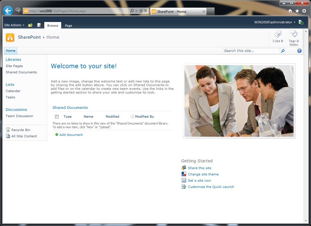
While you might argue about how things are displayed, the fact is that the mobile experience of SharePoint 2010 is much more suited for display on mobile devices than the standard desktop experience. Just to give you the idea: the standard experience is 1.2 MB while the mobile experience is only 24 KB! Not to mention how things are displayed on the screen!
So if SharePoint 2010 provides us with a mobile experience out of the box, why can’t we use it on an Internet-facing website?
The reason to this question can be seen on the screenshot below:
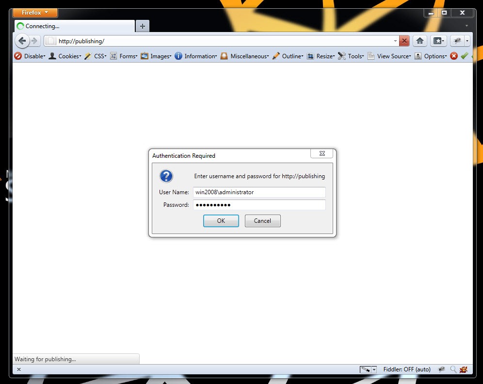
The SharePoint 2010 mobile experience that you’ve seen previously works only with authenticated users, which means that it’s useless on an Internet-facing website visited by anonymous users!
Unfortunately this is not the end of the challenge. Not only is the standard mobile experience useless on an Internet-facing website, but it also cannot be turned off. The mobile redirect is baked into the request processing module provided with SharePoint (the SPRequestModule HTTP module) and there is no on/off switch provided that you could flip to make it go away.
The workarounds – less than perfect
The issue of the SharePoint 2010 mobile redirect has been known for a while now and a few workarounds appeared as a solution to avoid the redirection.
See no evil, hear no evil…
The first one is to delete .browser files in the App_Browsers directory of your site. Since mobile capabilities are being detected based on the user agent string mappings defined in those files, deleting them makes the pain go away. The problem with this approach is, that it makes all browsers equal which isn’t entirely true. Different browsers have different capabilities and .browser files are there to make it easier for you to detect those differences and optimize your solutions based on the available capabilities.
Another workaround, which is a little less drastic, is to disable the recognition of mobile browsers only. It can be done by adding the following snippet in the system.web section of the web.config of your Web Application:
<browserCaps>
<result type="System.Web.Mobile.MobileCapabilities, System.Web.Mobile, Version=2.0.0.0, Culture=neutral, PublicKeyToken=b03f5f7f11d50a3a" />
<filter>isMobileDevice=false</filter>
</browserCaps>
The above snippet makes ASP.NET and SharePoint think that all browsers are desktop browsers and therefore no mobile redirect should be done. If you apply this workaround and navigate to your SharePoint site, you will be able to open it without the login prompt:
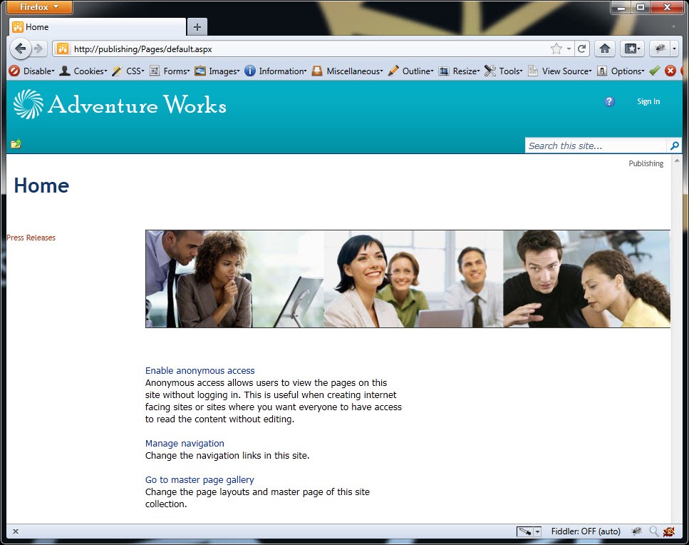
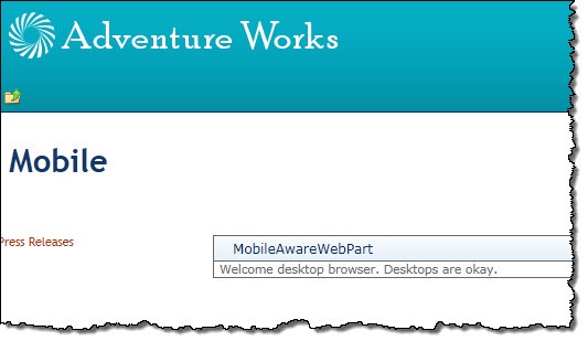
Although you can see the site, there is no way for you to tell if the browser is a mobile or a desktop browser and therefore you won’t be able to optimize your website for it. To illustrate it, let’s create a Web Part that displays different messages for different types of browsers:
public class MobileAwareWebPart : WebPart
{
protected override void RenderContents(HtmlTextWriter writer)
{
if (Page.Request.Browser.IsMobileDevice)
{
writer.Write("Welcome mobile browser! Mobile browsers are awesome.");
}
else
{
writer.Write("Welcome desktop browser. Desktops are okay.");
}
}
}
If you navigate to the site with the above workaround applied what you will see, is the message for desktop browsers. As mentioned before, this workaround makes all browsers look like desktop browsers.
You could of course write some code that would basically do the same as .browser files do, which is to parse the user agent string of the browser and based on that determine if the browser is a mobile browser or not, but that would mean that you would actually have to maintain the list of all mobile browsers in your code to make this work properly!
A while ago we have built a new version of our website here at Mavention and we have faced the same issue. However, instead of applying one of the workarounds I’ve just mentioned, we came up with a little more useful solution.
Mavention No Mobile Redirect – The solution
As I mentioned before the mobile redirect is being done in the BeginRequest event (which is the first event in the Page request pipeline) handler in the SPRequestModule HTTP module which is part of SharePoint 2010. The solution we came up was to mislead SharePoint and make it think we’re using a non-mobile browser while keeping all the browser information available to all custom code we might use on the website.
The first thing that we need to get this done is a custom HTTP Module:
public class MaventionMobileRequestHttpModule : IHttpModule
{
private HttpBrowserCapabilities browserCapabilities;
public void Init(HttpApplication context)
{
context.BeginRequest += new EventHandler(context_BeginRequest);
context.AuthenticateRequest += new EventHandler(context_AuthenticateRequest);
}
void context_BeginRequest(object sender, EventArgs e)
{
HttpApplication application = sender as HttpApplication;
browserCapabilities = application.Request.Browser;
application.Request.Browser = new MaventionMobileBrowserCapabilities(browserCapabilities);
}
void context_AuthenticateRequest(object sender, EventArgs e)
{
HttpApplication application = sender as HttpApplication;
application.Request.Browser = browserCapabilities;
}
public void Dispose()
{
}
}
Using this module we can hook up to the BeginRequest event and temporarily substitute the browser information with our own. The substitute is defined by the MaventionMobileBrowserCapabilities class and contains the most of the original information about the current browser except for the one:
public class MaventionMobileBrowserCapabilities : HttpBrowserCapabilities
{
public override bool IsMobileDevice
{
get
{
return false;
}
}
public MaventionMobileBrowserCapabilities() { }
public MaventionMobileBrowserCapabilities(HttpBrowserCapabilities browserCaps) : this()
{
if (browserCaps.Adapters != null && browserCaps.Adapters.Count > 0)
{
foreach (object key in browserCaps.Adapters.Keys)
{
Adapters[key] = browserCaps.Adapters[key];
}
}
Capabilities = browserCaps.Capabilities;
HtmlTextWriter = browserCaps.HtmlTextWriter;
}
}
Unfortunately in our custom browser capability class we are not able to set all the information from the original browser information. The important part here is to set the value of the IsMobileDevice property to false which will prevent SharePoint from redirecting you to the standard mobile pages.
With that in place two more things are left to see this working. First you need to deploy the assembly to either BIN or GAC, which is fairly easy. The second thing, that you have to do, is to register the HTTP Module with the Web Application. The important thing here is that you register it before the SPRequestModule HTTP module. Unfortunately the order of those HTTP modules does matter and if you register your HTTP module after the SPRequestModule, you will see SharePoint still redirecting mobile users to the standard SharePoint 2010 mobile pages.
Having that in place we can navigate to the site to see it working.
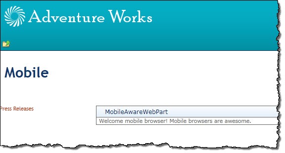
Not only we can open the page, but we also get the correct message that should be displayed for mobile browsers!
Summary
SharePoint 2010 ships with a mobile redirection functionality that presents optimized UX to mobile browsers. Unfortunately this standard functionality doesn’t support anonymous users what makes it useless for Internet-facing websites. Since it cannot be easily disabled there are some workarounds to make it possible for anonymous users to visit the site using a mobile device. The downside of those workarounds is that they disable mobile browser recognition making it impossible to optimize the UX for mobile browsers. Using a simple solution developed at Mavention you can avoid the standard mobile redirect and yet be able to optimize your website for mobile browsers.


March 27th, 2011 at 2:26 pm
Another problem is that only the simplest web parts display in the mobile view. Without complex web parts, such as the dashboard scorecard web parts, the mobile view is nice idea, but ultimately useless.
March 28th, 2011 at 6:20 am
Great post
-ivan
March 28th, 2011 at 8:57 am
We've done a something similar for our own website but we use the redirect to take users to an entirely different (ASP.Net MVC/jQuery Mobile) mobile site. So we don't experience the issue of losing the IsMobileDevice functionality. Although, as you point out we would have to maintain a list of browser devices, if we weren't using this : http://blog.mobileesp.com/.
Another issue we had to get around was the publishing cache. The redirect wouldn't fire for a mobile device if the page was already cached for a non-mobile device. We had to create a specific Cache Profile for our homepage (we only redirect visitors to the homepage) and then create a custom cache handler (see IVaryByCustomHandler) that then differentiated browsers using the mobileesp mobile detection. Though I'm now wondering whether we broke the OOB caching by adding the web.config browserCaps setting above. Hmmm.. you've got me thinking now.
April 6th, 2011 at 7:56 am
A very helpful blog indeed. Initially got a couple of errors but could manage to establish the connection and create the mobile version of my custom webpart which is a simple webpart. But in another try i have created another custom webpart which has a standard login page consisting of 2textboxes,2 buttons.I have not been able to view this web part in the mobile view of the page. a certain code should go into the CreateDetailView() method of the adpater class and im not able to find the needed code. Could you kindly help in provinding insights with th same or any kind of materials where i can refer and solve this.
Thanks in advance.
April 6th, 2011 at 3:24 pm
The mobile redirect HTTP Module has nothing to do with Control Adapters. What is it that you are trying achieve exactly?
April 7th, 2011 at 7:54 pm
Great Post! I was looking for something similar.
One quick question, it seems like it works for me… However, the only thing is that the web part always returns as if it was a desktop browser (as opposed to mobile like in your final screenshot).
Is that because the 'IsMobileDevice' property is always false????
do I need to change something on the web part? I am a bit confused..
Thanks!!
April 8th, 2011 at 4:29 am
@Luciano: The IsMobileDevice is being set only in the very first stage of the request/response pipeline so at the moment that your code runs, you should be able to get the complete (original) browser information including the real value of the IsMobileDevice property. How have you been testing the mobile device if I may ask?
April 8th, 2011 at 10:19 am
@Waldek,
Thanks for replying. I have been using only an iphone so far. I will try with blackberry later.
Actually what I needed was a way to detect mobile or desktop within the httpmodule, so I used the browser.Platform which returned 'winNT' (for desktop) and 'unknown' for mobile… :) so i think it's ok.
I was just confused because the isMobileDevice always returned false in my webpart. I will test a bit more.
April 26th, 2011 at 3:39 pm
Great post! I have been digging around in search of a solution that could be used in a hosted environment, i.e. for SharePoint Foundation site hosted w/ a provider. We are building a public-facing site on SharePoint Foundation and have run into this exact issue. In this case we do not have server access either to modify the compat.browser file and/or deploy a custom HTTP Module. Is there any other method you can think of or have found that could be used in a hosted scenario?
April 30th, 2011 at 8:07 am
@Susan: Unfortunately not. Mobile redirect is baked into the SPRequest module and the only way to get around it is to either register a custom HTTP Module before SPRequest or modify the .browser file.
May 2nd, 2011 at 3:05 pm
Hey Waldek,
Thanks for the response. That is a real bummer. Any hosted SP 2010 site is going to be pretty much useless for public-facing now. The list-view (mobile view) that they are redirecting to is just plain ugly! I have to say that MSFT made a bad choice on defaulting to this view, now there is no real selling point for some clients looking to go public while finding an inexpensive shared hosting plan. Thank you for responding though :)
May 9th, 2011 at 1:15 am
Great post. Does SharePoint 2010 supports android, palm and opera mobi browsers? Do you have any articles which SharePoint 2010 supported browsers for mobile devices?
May 18th, 2011 at 9:25 pm
@Rohit: Well, it depends a lot what you mean with "support". Do you expect to have the full functionality or is presenting the content in a simplified fashion enough? Support for mobile browsers is based on the .browser file which contains information about browser/device specific capabilities. Depending on your device and specific scenario you could consider tweaking that file to improve the experience.
June 30th, 2011 at 3:16 pm
I wonder what happens with the mavention solution when the user writes in the querystring "mobile=1". It still will redirect right? still great solution thanks.
July 4th, 2011 at 5:23 pm
@Andre: Although I haven't tried it, I would expect it to use the default mobile redirect.
September 1st, 2011 at 2:56 pm
Waldek,
This is just what I was looking for! Thank you.
Regards,
EStruyf
September 7th, 2011 at 9:25 pm
Can you post for me the line you are adding into the web.config. I can't seem to get it right and its driving me crazy.
September 8th, 2011 at 10:19 am
@Rich: Here you go:
<add name="MaventionMobileRequestHttpModule" type="Mavention.SharePoint.HttpModules.MaventionMobileRequestHttpModule, Mavention.SharePoint.Controls, Version=1.0.0.0, Culture=neutral, PublicKeyToken=0000000000000000" />
September 8th, 2011 at 4:18 pm
Thanks Waldek… turns out I just didn't know how to copy and paste properly. Next question… I have Blackberry internal users who are connecting to the site internally and are getting identified as Desktop users. I'm pretty sure they are getting logged into the site and some kind of forwarding is getting done on their headers (or something like that).
As another comment, my iPhone simulator is correctly getting identified as a mobile device in this solution.
September 8th, 2011 at 5:08 pm
@Rich: it's probably their User-Agent string that isn't specified in the compat.browser file. You can either download a newer copy of the file from the Internet or add their specific User-Agent string to the existing .browser file.
December 15th, 2011 at 2:09 pm
Hello, thanks you for the post.
I've a question about performance ? since the page is gonna be loaded with the full masterpage of a Computer browser, is it possible to load a different masterpage for a mobile ? And how ?
Thanks you a lot
December 16th, 2011 at 12:44 pm
You could switch Master Page dynamically just as you would on a regular ASP.NET site: http://msdn.microsoft.com/en-us/library/c8y19k6h.aspx
January 13th, 2012 at 1:28 pm
Is there a way to disable the Mobile Redirect Feature on a hosted SharePoint ( basically when I don't have access to web.config or browse.compat files ) ? Thanks
January 13th, 2012 at 1:48 pm
I have just seen the answer above.sorry.
January 16th, 2012 at 9:52 am
@Dan: I'm afraid not.
February 9th, 2012 at 9:35 pm
This solution does not works for me.
February 10th, 2012 at 5:34 pm
@Mahi: Are you getting any errors? Have you tried debugging the code?
March 9th, 2012 at 7:27 am
Hi Waldek,
Nice post.
First to tell for "that it’s useless on an Internet-facing website visited by anonymous users!", If a site is in an anonymous zone then you will not be prompted with log in stuff
My Question is
If a customer deploys a public facing web site using SharePoint 2010, what would your approach be for making a mobile friendly version.
March 12th, 2012 at 7:29 pm
@Kunal: I guess it depends a lot on what your requirements are. If the majority of the content and URLs are the same as for a desktop version you could consider using Adaptive Web Design and tweaking the user experience by using CSS. If the mobile version is different than the desktop one you could either consider creating a whole separate site or use a solution such as Mavention Flex Layout which allows you to build separate experience for different devices/audiences.
July 4th, 2012 at 3:47 pm
Hi Waldek,
I'm new to SP and I tried your tutorial it's working fine. There is already have a desktop version and need a mobile version too. Desktop version is a publishing site that have used lot of OOTBs and webparts. What my requirement is using some existing lists and libraries of the desktop version create a different look of mobile version. what is the best method to achieve that ? Can I create a different Home page(not desktop one)to mobile version and then redirect to it using your way if user enters the same desktop URL? How ?
July 9th, 2012 at 8:06 am
If all you need is a different look then you could try to create CSS files specially for mobile devices. You could do the targeting using CSS media queries.
September 20th, 2012 at 3:36 pm
Great post! I have a humble contribution – you can include the parameter "Mobile=0" in the querystring to force SharePoint handle the request as it came from a non-mobile device. Please, check http://msdn.microsoft.com/en-us/library/ms462572.aspx to know more details. It did work fine for me.
Best regards,
Murilo
September 20th, 2012 at 3:38 pm
Thank you for the tip!
November 5th, 2012 at 11:20 am
Hi,
I followed your instructions, however when i combine this with a Claims Based Authenticated site and a custom login page, i'm always redirected from _layouts/Authenticate.aspx to mblerror.aspx
Any idea what's causing this?
Regards
November 6th, 2012 at 1:07 pm
Seems like there is still something that's causing the user to authenticate. Have you tried looking at the requests and responses to get a better idea of what it might be?
January 18th, 2013 at 10:35 pm
Do variations still work correctly using your solution? For instance if I wanted to create a variation that targets mobile users would they see that variation if we implement your above solution for anonymous users?
January 18th, 2013 at 10:42 pm
Yes, they would. The only thing that you would need to do yourself is to take care for the redirect from the root of your website to the mobile variation.
February 1st, 2013 at 6:26 pm
Hi Waldek, I made the browserCaps change in my web.config file and it still hasn't fixed the issue. Is there a specific spot in the file I need to place it (other than in a tag? Do I need to do an iisreset?? Thanks for your help in advanced.
February 2nd, 2013 at 2:02 pm
If you change web.config you should see the changes immediately. Are you sure you have changed the right thing in the right web.config?
February 26th, 2013 at 2:51 am
Hey – thanks for this post!
I've got a folder in IIS that's actually outside of SharePoint, and was working great in regular browsers, but got picked up by SP mobile – I dropped in a minimal web.config in that folder with the browsercaps change and its working on my phone now!
For Dana,
My Plain Web.config looks something like this:
An ?xml version line
a configuration line
a system.web section
then add browsercap stuff
then close system.web
then close configuration
if you're adding to the sharepoint web.config – you need to find the correct system.web entry – there were multiple entries in mine – you want the one thats nested one level below the configuration tag
March 15th, 2013 at 1:07 am
Simple http://msdn.microsoft.com/en-us/library/ms441925%28v=office.14%29.aspx
read it and do what the documentation does and go ahead.
April 12th, 2013 at 8:48 pm
Is there a listing of which web parts are supported in the SharePoint 2010 mobile views. Is the Pager Viewer web part supported?
April 29th, 2013 at 3:28 am
Hi Waldek,
We have around 100+ standard Sharepoint2010 sites on our intranet which are recently migrated to 2010 from 2007. Now the management's requirement is to access these sites on mobile devices mainly on iPhone and Black Berry. Do I need to do any modifications in the site level or create/change the pages for mobile devices. Most of the sites are having webparts also.
April 29th, 2013 at 8:44 am
It depends a little on your requirements and the functionality that you are using and which you would like to be available on mobile devices. Have you checked whether the default user experience is sufficient for your scenario?