Build custom controls for the SharePoint Framework web part property pane
When building SharePoint Framework web parts you might want to provide your users with a user experience for configuring the web part beyond what’s available out of the box. Here is how you can build custom property pane controls for SharePoint Framework web parts.
Configuring web parts
SharePoint Framework offers developers a number of standard controls for using with web part properties. These controls, such as a dropdown, a text field or a slider, address the most common needs when building web parts.
Why custom web part property pane controls
Using the right control for each web part property makes it easier for users to configure the web part correctly and avoid errors. And while the SharePoint Framework provides developers with the most commonly used controls, what if you needed a color picker for your users to choose a color or a map control to select a location?
When you need user experience other than what’s offered by the building blocks provided with the SharePoint Framework, you can build custom property pane controls that address your specific needs.
Build custom web part property pane control
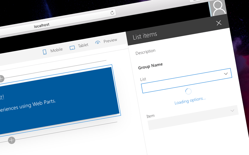
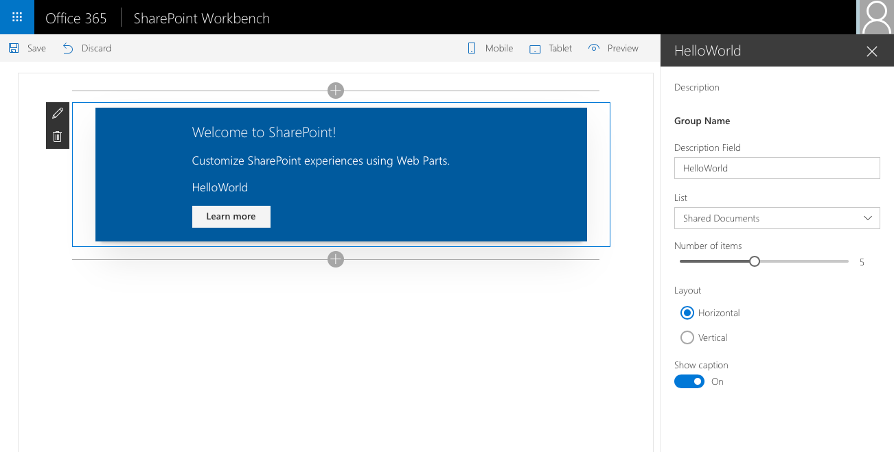
Recently Microsoft published a tutorial illustrating the step-by-step process of building custom property pane controls for SharePoint Framework web parts. Vesa Juvonen and I discussed the topic in a recent SharePoint PnP webcast as well. Building custom web part property pane control isn’t overly complex but there are a few key elements that you have to understand for the control to work correctly. As an example the tutorial describes the process of building a custom dropdown that loads its options asynchronously and which is also capable of being used for building cascading dropdowns. Here is the summary of the key steps.
Implement the base property pane control interface
Every SharePoint Framework web part custom property pane control must implement the IPropertyPaneField<TProperties> interface, where the TProperties type describes the properties that developers using the control in their web part can configure, such as label, whether the control is enabled or not, event handlers, etc.
In the example used in the tutorial, the custom dropdown property pane control defines the following interface for its properties:
export interface IPropertyPaneAsyncDropdownProps {
  label: string;
  loadOptions: () => Promise<IDropdownOption[]>;
  onPropertyChange: (propertyPath: string, newValue: any) => void;
  selectedKey: string | number;
  disabled?: boolean;
}
The property pane control is defined as follows:
export class PropertyPaneAsyncDropdown implements IPropertyPaneField<IPropertyPaneAsyncDropdownProps> {
  constructor(targetProperty: string, properties: IPropertyPaneAsyncDropdownProps) {
    // ...
  }
}
Developers building web parts can instantiate this control as follows:
export default class ListItemsWebPart extends BaseClientSideWebPart<IListItemsWebPartProps> {
// ...
protected get propertyPaneSettings(): IPropertyPaneSettings {
return {
pages: [
{
header: {
description: strings.PropertyPaneDescription
},
groups: [
{
groupName: strings.BasicGroupName,
groupFields: [
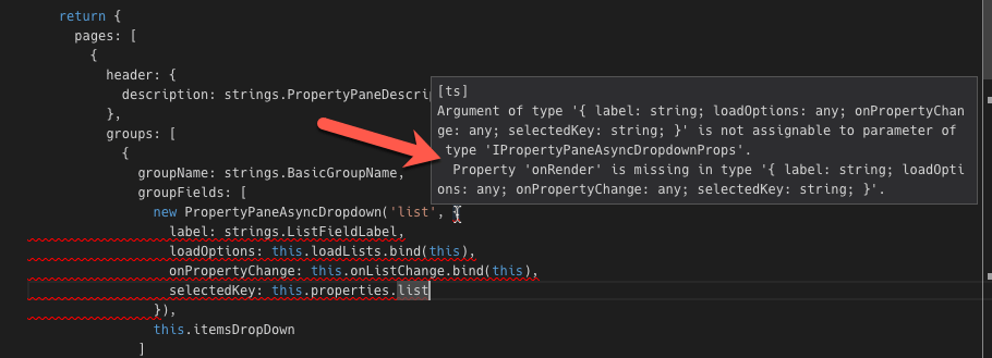
new PropertyPaneAsyncDropdown('list', {
label: strings.ListFieldLabel,
loadOptions: this.loadLists.bind(this),
onPropertyChange: this.onListChange.bind(this),
selectedKey: this.properties.list
})
]
}
]
}
]
};
}
// ...
}By implementing the IPropertyPaneField<TProperties> interface you have to define three properties in your custom property pane control class:
type- type of the control which for custom controls must be set toIPropertyPaneFieldType.Custom,targetProperty- name of the web part property used to managed by this control,properties- properties of the custom property pane controls that can be configured by developers using the control
Inconvenient custom property pane control properties
Looking at the IPropertyPaneField<TProperties> interface its properties property is of the TProperties type. But there is more to it than meets the eye. On runtime, the properties property is expected to be implementing the IPropertyPaneCustomFieldProps interface which, at minimum, requires the implementation of the onRender method.
export interface IPropertyPaneCustomFieldProps {
  onRender: (domElement: HTMLElement, context?: any) => void;
  onDispose?: (domElement: HTMLElement, context?: any) => void;
  context?: any;
}
The onRender method is responsible for rendering the custom property pane control in the property pane and is called by the SharePoint Framework when user opened the property pane.
One way to compose the interface for the TProperties type, which on one hand must include methods from the IPropertyPaneCustomFieldProps interface, required by the SharePoint Framework, and at the same should specify additional properties that developers should be able to configure when using the control in their web part, would be to have the custom TProperties interface inherit from the IPropertyPaneCustomFieldProps interface:
export interface IPropertyPaneAsyncDropdownProps extends IPropertyPaneCustomFieldProps {
  // ...
}
The problem with this approach would be that developers using the control in their web part would be expected to set the onRender method, responsible for rendering the control in the property pane!
Another way, used in the tutorial, is to have two interfaces describing the properties of the custom control: one exposed publicly to developers using the custom property pane control, and one used internally inside the control so that it can meet the requirements set by the SharePoint Framework.
The interface exposed publicly to developers using the control specifies nothing but the public properties that can be configured on the control:
export interface IPropertyPaneAsyncDropdownProps {
  label: string;
  loadOptions: () => Promise<IDropdownOption[]>;
  onPropertyChange: (propertyPath: string, newValue: any) => void;
  selectedKey: string | number;
  disabled?: boolean;
}
Then, another interface, meant for internal use inside of the control, is defined to combine the public interface and the IPropertyPaneCustomFieldProps interface from the SharePoint Framework:
export interface IPropertyPaneAsyncDropdownInternalProps extends IPropertyPaneAsyncDropdownProps, IPropertyPaneCustomFieldProps {
}
When defining the class for the custom property pane class, the public interface is used as the TProperties type, but the internal interface is used as the type for the properties property.
export class PropertyPaneAsyncDropdown implements IPropertyPaneField<IPropertyPaneAsyncDropdownProps> {
  public properties: IPropertyPaneAsyncDropdownInternalProps;
  // ...

  constructor(targetProperty: string, properties: IPropertyPaneAsyncDropdownProps) {
    this.properties = {
      label: properties.label,
      loadOptions: properties.loadOptions,
      onPropertyChange: properties.onPropertyChange,
      selectedKey: properties.selectedKey,
      disabled: properties.disabled,
      onRender: this.onRender.bind(this)
    };
    // ...
  }

  private onRender(elem: HTMLElement): void {
    // ...
  }
}
This way developers using the control can pass all properties in the constructor which can be then assigned to the properties property and combined with the assignment of the onRender method responsible for rendering.
Summary
When building SharePoint Framework client-side web parts you might need user experience beyond what’s offered by the standard building blocks to help users easily configure your web part. You can achieve this by building custom property pane controls that meet your requirements. Building custom property pane controls for SharePoint Framework web parts isn’t overly complicated. There are however a few things that you need to keep in mind. Recently Microsoft published a tutorial describing the process of building custom property pane controls step-by-step.
Follow the tutorial: Build custom controls for the property pane (dev.office.com) View code sample: Custom property pane controls built in React (GitHub) Watch PnP webcast: Custom Property Pane Controls with SharePoint Framework (YouTube)