
How we did it: mavention.nl – Part 4: Optimizing for the Web
Building Internet-facing websites on the SharePoint platform requires you not only to understand how SharePoint works but also to know what the Web is about and how things work there. In this part of the How we did it series about our brand new website I will show you some things that we implemented to make our website a better Web citizen.
Intranet vs. Internet
Developing Internet-facing websites is different than building intranet solutions. When building a solution for an intranet you know your audience. You know who they are and what technology they are using: you know for example if you need to provide an interface for mobile devices and if Internet Explorer is the only browser you have to support.
When developing an Internet-facing website you are far not that “lucky”. First and the most important of all you’re developing for the world. Eventually the website will be publicly available and even if your customer has a specific audience you cannot really tell who will visit the website. “Make it just work” is not really an option when working with Internet-facing website and you will have to put some additional effort to do things right.
Define your scope
Probably the most important thing when starting the work on a new Internet-facing website is to define the scope. One of the things that you have to agree on with your customer is which browsers should the new website be tested in. Because there are many different browsers each in many different versions, working on different operating systems and devices you are not able to test all of them. Instead you should always try select a few browsers that are most used by your audience and focused your test efforts there.
When working on our website we used analytics data from our old website to get more information about browsers that our visitors are using. The majority of people visiting our website is using Internet Explorer followed by Firefox both on the Windows OS. This information allowed us to narrow the test process from all to two browsers on a single OS and a couple of versions.
Although selecting the browsers that you will be focusing on simplifies the development process it doesn’t mean that your website won’t work in other browsers – at least it shouldn’t mean that. Writing standards-compliant markup for your templates can help you extend the range of browsers that can display your website as close as possible to perfect. While working on our website Paul did some great job crafting XHTML-strict compliant HTML templates for our new website. Using Mavention Flex Layout we were able to implement all those templates in SharePoint exactly as Paul created them. As a result, although we focused on Internet Explorer 8 and 7 and Firefox 3x on Windows, probably all modern browsers on most devices should be able to properly display our website.
If you’re curious how different browsers render our website check out Browser Shots and enter the URL of our website. Although it’s not always pixel perfect, the content is readable and you can clearly see that it’s the Mavention website that you are looking at.
It’s really for everybody
When working on an Internet-facing website you have to be really careful when making assumptions about your visitors. While your customer might exactly know who the people working in his company are, you never really know who will visit the website that you are building for him. This is exactly why planning for accessibility is important.
Accessibility is not just about blind people. Making an accessible website means making its contents available to every user regardless the device, the browser or the disability that someone might have. Although it sounds simple, it coves a broad spectrum of things that you have to take into account, such as making all content available in browsers that don’t support images, CSS and maybe even JavaScript. Yes it really does matter.
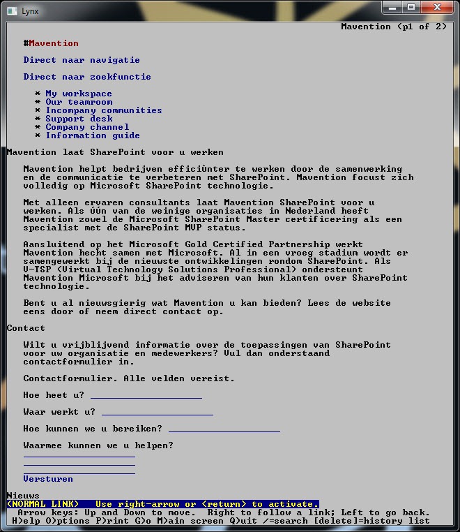
When designing HTML templates for our website, Paul started off with creating HTML that would work in text-only browsers. By arranging the HTML pieces based on their importance rather than visual placement, he was able to create document structure that would make it easier for our visitors to read the most relevant content on our website.
If you would use the visual placement of elements as a guideline you would probably come up with a structure similar to the following:
<site>
    <header>
        <logo />
        <mainNav />
    </header>
    <body>
        <bodyWrapper>
            <pageBanner />
            <mainContent />
            <sideColumn />
        </bodyWrapper>
        <sidebar />
    </body>
    <footer />
</site>
However, if you look at our website, the structure that we are using is different:
<skipLinks />
<site>
    <mainContent />
    <sideColumn />
    <sidebar />
    <mainNav />
    <header>
        <pageBanner />
    </header>
    <metaNav />
    <logo />
    <footer />
</site>
Two things are clear from the approach we’ve taken. First of all the markup of our site is ordered by importance rather than visual placement. This means that not only people who use text browsers can quickly read the contents of our pages but it will be easier for us to move to another template should we ever need to.
Another great benefit that using the importance as guideline has given us is that the markup structure of our website is really flat and easy to follow so search engines can easily parse our pages.
Starting from the plain HTML instead of the visual design allowed us to focus on the semantics of the markup and to ensure that it really makes sense, rather than worrying if it will look okay.
Once we had the HTML in place, Paul started adding graphics and CSS to make the HTML look more like the graphic design that we wanted to use on our new website.
Page not found
When launching a new website with a new structure, for a moment the ‘Page not found’ page becomes one of the most frequently visited pages. Changing the structure means in many cases changing the URLs which leads to breaking existing links.
If you look at SharePoint 2010, the default ‘Page not found’ is pretty useless – we have already discussed that. One of the things that ended pretty high up our priority list for the first release was a custom ‘Page not found’ page. We implemented it using the exact approach I showed you on my blog not so long ago. Using a custom HTTP Module we were able to intercept all 404 responses and by adding a 404 Web Part to our page we were able to return proper response.
One thing that didn’t make it to the first release was a Page Not Found Widget that would help our visitors to find the content that they were looking for. The reason for that was the fact that we didn’t have search implemented at that moment. The good news is, that we have everything in place now and we will be fixing it shortly.
Mavention.nl and mobile devices
Just a few hours after we launched our new website, we have received quite a few comments about our website not working on mobile devices. Not surprisingly because we didn’t really focus on the mobile experience. Most of the modern browsers on mobile devices are capable of rendering rich HTML so we assumed that we didn’t have to do much work in that area in the first release. While we weren’t wrong, we missed one thing: by default as soon as SharePoint finds out that you are using a mobile device, it’s redirecting to the mobile view which isn’t really tailored for Internet-facing websites.
We worked around this issue by disabling the recognition of mobile devices using the following web.config entry:
<system.web>
    <browserCaps>
        <result type="System.Web.Mobile.MobileCapabilities, System.Web.Mobile, Version=2.0.0.0, Culture=neutral, PublicKeyToken=b03f5f7f11d50a3a" />
        <filter>isMobileDevice=false</filter>
    </browserCaps>
</system.web>
Once we had this in place mobile devices were able to browse to our website.
Although mobile UI didn’t make it to for the first release, it is definitely something we are still thinking about. There is a chance that we will launch a mobile version of our website somewhere later this year.
Controlling the mobile layout using viewport
Although we didn’t provide a fully optimized experience for mobile devices we did one thing to make our website look a little better.
In our Master Page we added the viewport meta tag and set its width to 990 pixels which is slightly more than the width of our layout. Adding the viewport allows you to lock the dimensions and scale making it easier to improve the presentation of your web pages on mobile devices.
Configuring the view port is not difficult and can be done by adding the viewport meta tag to the head section of your page:
<head>
    <meta name="viewport" content="width=990" />
</head>
Although on our website we used the viewport to lock the width, the viewport allows you to control your layout even more by setting other properties like height and scale.
Summary
In this part of the How we did it series on our new website I’ve showed you how we optimized our website to be used on the Internet. Building Internet-facing solutions is different than building solutions for intranets and there are a lot of things that you have to take into account, that might be new to you, even if you are a seasoned SharePoint developer.
What’s next
In the next part of the series I will show you how we created the RSS feed for our website using the standard capabilities of the SharePoint 2010 platform. Stay tuned!
Technorati Tags: SharePoint 2010,Web Content Management