Building SharePoint Framework Client-Side Web Parts with React
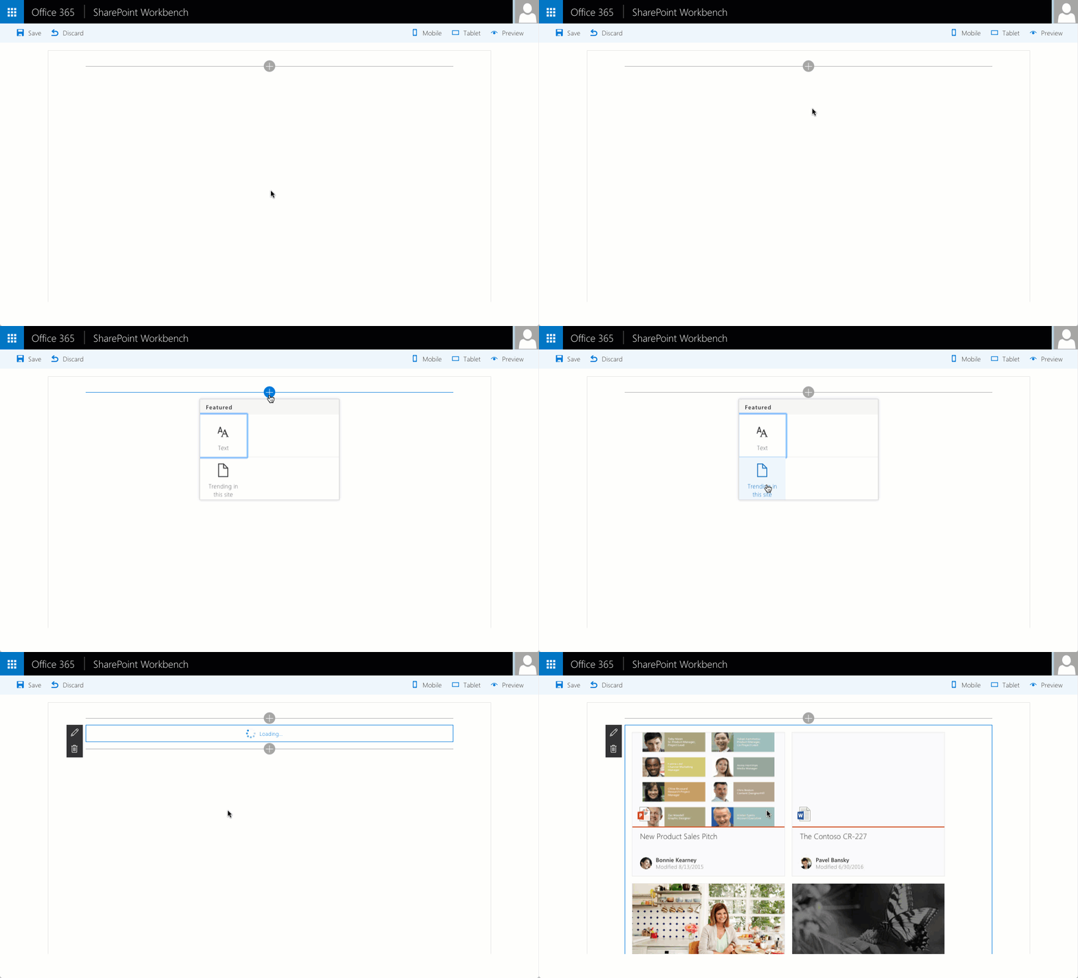
SharePoint Framework natively support building Client-Side Web Parts using React. Here is a sample Web Part illustrating the different pieces of a Client-Side Web Part built using React.
React for Web Parts
React is a powerful framework for building web applications with dynamic user interfaces. It’s focusing on the UX part of the applications and requires other building blocks for things link navigation or processing events. React is particularly useful in cases where the contents of the application change a lot as it can efficiently update the page’s DOM.
What’s attractive about using React for building Client-Side Web Parts on the SharePoint Framework is that the SharePoint Framework itself is built using React so React is already available for you to use. Because end-users don’t need to load any other framework first, your Web Parts will load faster initially.
Building SharePoint Framework Client-Side Web Parts with React
The SharePoint Framework Yeoman generator supports React as one of the frameworks for building Client-Side Web Parts. If you choose React as your framework, the generator will scaffold for you a working Client-Side Web Part built using React and you will be able to directly start building your Web Part without having to install any dependencies.
Building React Client-Side Web Parts with style
An important part of each Web Part is its user experience. The more it blends in on the page the more it feels like a part of the page and the easier it is for end-users to use.
If you want to build Web Parts that look and feel like SharePoint, you should use Office UI Fabric. Next to standard styles and fonts, that you can see in SharePoint and other Office applications, Office UI Fabric offers us a set of components that we can use as building blocks for the UX of our Web Parts. To simplify using Office UI Fabric with React Microsoft published Office UI Fabric React components. Similar to React itself Office UI Fabric React is already available for you to use as a part of the SharePoint Framework.
Getting started building SharePoint Framework Client-Side Web Parts with React
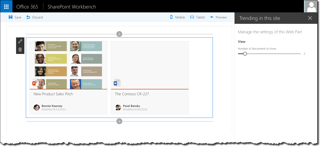
To illustrate how to build Client-Side Web Parts with React, I’ve built a sample Web Part showing the list of documents trending in the particular site.
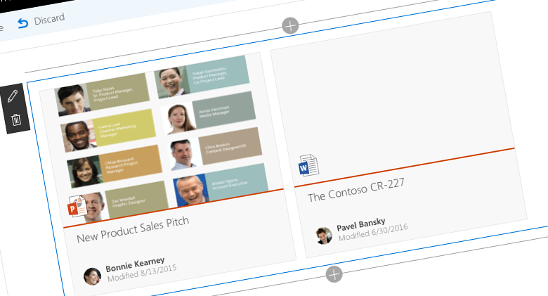
The Trending in this site Web Part uses the Office Graph to get the list of documents trending in the current site. Trending documents are displayed using the DocumentCard Office UI Fabric component. Because all the Web Part does, is showing the trending documents, it doesn’t implement Flux or other event-driven architectures in React.
The source code of this Web Part is available on GitHub at https://github.com/waldekmastykarz/spfx-react-fabric-trendinginthissite.
Building Client-Side Web Parts with React
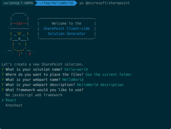
The SharePoint Framework Yeoman generator supports generating Client-Side Web Part built using React. This makes building Client-Side Web Parts with React as easy as choosing React as the framework to use in the SharePoint Framework Yeoman generator.
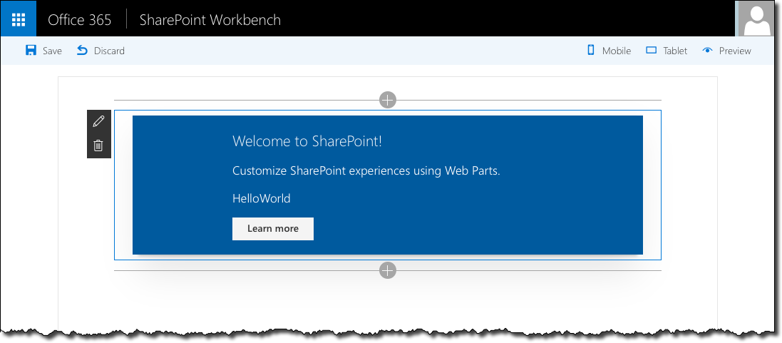
Once the generator completes, you will have a working Client-Side Web Part using a React component in your project.
Passing properties from Web Part into React component
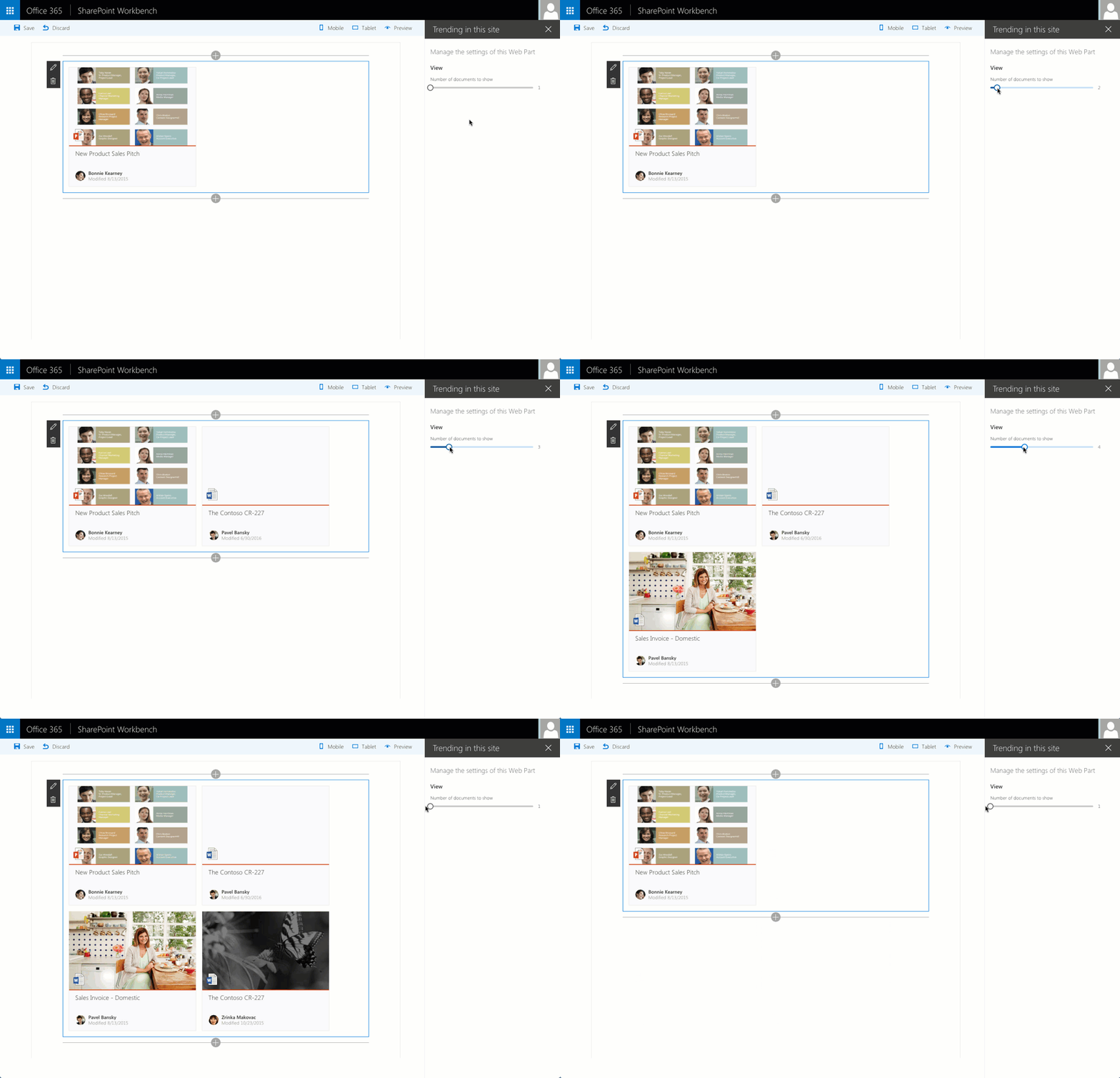
In our example we want the Web Part to show documents trending in the current site, where the user herself can choose how many trending documents the Web Part should show. To achieve this, we have to pass two parameters to our React component: the number of documents to show and the URL of the current site.
Because we can get the URL of the current site ourselves, we won’t bother the user with it, but we definitely want her to be able to choose the number of documents to show. For this we define it as a Web Part property. First, in the Web Part manifest:
{
  "$schema": "../../../node_modules/@microsoft/sp-module-interfaces/lib/manifestSchemas/jsonSchemas/clientSideComponentManifestSchema.json",

  "id": "dc8a04f5-63f0-454d-9590-e045a1276bd1",
  "componentType": "WebPart",
  "version": "0.0.1",
  "manifestVersion": 2,

  "preconfiguredEntries": [{
    "groupId": "dc8a04f5-63f0-454d-9590-e045a1276bd1",
    "group": { "default": "Content rollup" },
    "title": { "default": "Trending in this site" },
    "description": { "default": "Shows documents trending in this site" },
    "officeFabricIconFontName": "Page",
    "properties": {
      "numberOfDocuments": 5
    }
  }]
}And then in Web Part’s code:
export default class TrendingInThisSiteWebPart extends BaseClientSideWebPart<ITrendingInThisSiteWebPartProps> {

  // omitted for brevity

  protected get propertyPaneSettings(): IPropertyPaneSettings {
    return {
      pages: [
        {
          header: {
            description: strings.PropertyPaneDescription
          },
          groups: [
            {
              groupName: strings.ViewGroupName,
              groupFields: [
                PropertyPaneSlider('numberOfDocuments', {
                  label: strings.NumberOfDocumentsFieldLabel,
                  min: 1,
                  max: 10,
                  step: 1
                })
              ]
            }
          ]
        }
      ]
    };
  }
}Here we use a slider for the user to choose the number of documents to show between 1 and 10.
Next, we pass the selected number of documents as well as the URL of the current site into our React component:
const element: React.ReactElement<ITrendingInThisSiteProps> = React.createElement(TrendingInThisSite, {
  numberOfDocuments: this.properties.numberOfDocuments,
  siteUrl: this.context.pageContext.web.absoluteUrl
});

ReactDom.render(element, this.domElement);Finally, we extend the component with logic necessary for the component to use the passed properties for loading data both initially as well as responding to property changes later on:
export default class TrendingInThisSite extends React.Component<ITrendingInThisSiteProps, ITrendingInThisSiteState> {
  constructor(props: ITrendingInThisSiteProps, state: ITrendingInThisSiteState) {
    super(props);
  }

  public componentDidMount(): void {
    this.loadTrendingContent(this.props.siteUrl, this.props.numberOfDocuments);
  }

  public componentDidUpdate(prevProps: ITrendingInThisSiteProps, prevState: ITrendingInThisSiteState, prevContext: any): void {
    if (this.props.numberOfDocuments !== prevProps.numberOfDocuments ||
      this.props.siteUrl !== prevProps.siteUrl && (
        this.props.numberOfDocuments && this.props.siteUrl
      )) {
      this.loadTrendingContent(this.props.siteUrl, this.props.numberOfDocuments);
    }
  }

  private loadTrendingContent(siteUrl: string, numberOfDocuments: number): void {
    // omitted for brevity
  }
}Communicating state changes in the Web Part
Loading the list of documents trending in the current site using the Office Graph consists of a few requests and might take a moment to load. We also should take it into account that on rare occasions even an error might occur. In all these cases you want to communicate what the Web Part is doing to the user. In React this is done using state.
Our sample Web Part has three states: it’s either loading trending documents, showing trending documents or showing an error if one occurred. This can be wrapped in the following interface:
export interface ITrendingInThisSiteState {
  trendingDocuments: ITrendingDocument[];
  loading: boolean;
  error: string;
}To use this interface, it has to be used as the state type when defining the React component. Additionally, you should specify the initial state of the component in its constructor.
export default class TrendingInThisSite extends React.Component<ITrendingInThisSiteProps, ITrendingInThisSiteState> {
  constructor(props: ITrendingInThisSiteProps, state: ITrendingInThisSiteState) {
    super(props);

    this.state = {
      trendingDocuments: [] as ITrendingDocument[],
      loading: true,
      error: null
    };
  }
}Whenever a state is changed (Web Part loaded trending content or an error has occurred), the component should call the standard React setState function passing the new state:
trendingDocuments.forEach((result): void => {
  component.setState((previousState: ITrendingInThisSiteState, curProps: ITrendingInThisSiteProps): ITrendingInThisSiteState => {
    previousState.trendingDocuments.push(result);
    return previousState;
  });
});
Every time state is changed React will likely repaint the component by calling its render function.
Communicating with SharePoint using its REST API
React focuses on the UX part of the web application. For all other elements, like executing web requests, you need to use separate building blocks. While you could use some package for easy issuing web requests, our sample application uses a simple wrapper around the native XMLHttpRequest object with ES6 Promises (available as part of the SharePoint Framework):
private request<T>(url: string, method: string = 'GET', headers: any = null, data: any = null): Promise<T> {
  return new Promise<T>((resolve, reject): void => {
    const xhr: XMLHttpRequest = new XMLHttpRequest();
    xhr.onreadystatechange = function (): void {
      if (this.readyState === 4) {
        if (this.status === 200) {
          resolve(this.response as T);
        }
        else if (this.status >= 400) {
          reject({
            message: this.response['odata.error'].message.value,
            statusText: this.statusText,
            status: this.status
          });
        }
      }
    };

    xhr.open(method, url, true);
    if (headers === null) {
      xhr.setRequestHeader('Accept', 'application/json;odata=nometadata');
    }
    else {
      for (var header in headers) {
        if (headers.hasOwnProperty(header)) {
          xhr.setRequestHeader(header, headers[header]);
        }
      }
    }
    xhr.responseType = 'json';
    xhr.send(data);
  });
}This function can be used both with simple GET requests:
component.request(`${siteUrl}/_api/Web/AssociatedMemberGroup/Users?$select=Email`).then((members: { value: { Email: string }[] }): void => {
  // omitted for brevity
}, (error: any): void => {
  // omitted for brevity
});As well as with POST requests sending data:
component.request(`${siteUrl}/_api/search/postquery`, 'POST', {
  'Accept': 'application/json;odata=nometadata',
  'Content-Type': 'application/json;odata=verbose',
  'X-RequestDigest': requestDigest
}, postData).then((data: any): void => {
  // omitted for brevity
}, (error: any): void => {
  // omitted for brevity
});Rendering trending documents using the Office UI Fabric Document Card component
Once the Web Part retrieved the list of trending documents, it renders them using the Office UI Fabric Document Card component. Although Office UI Fabric React components are already available in the project dependencies, the specific components need to be loaded into our component. This is done by adding an import statement to our component:
import {
  DocumentCard,
  DocumentCardPreview,
  DocumentCardTitle,
  DocumentCardActivity,
  Spinner
} from 'office-ui-fabric-react';Next, in the render function we render the different states of our component:
public render(): JSX.Element {
  const loading: JSX.Element = this.state.loading ? <div style={{margin: '0 auto'}}><Spinner label={'Loading...'} /></div> : <div/>;
  const error: JSX.Element = this.state.error ? <div><strong>Error:</strong> {this.state.error}</div> : <div/>;
  const documents: JSX.Element[] = this.state.trendingDocuments.map((doc: ITrendingDocument, i: number) => {
    const iconUrl: string = `https://spoprod-a.akamaihd.net/files/odsp-next-prod_ship-2016-08-15_20160815.002/odsp-media/images/filetypes/32/${doc.extension}.png`;
    return (
      <DocumentCard onClickHref={doc.url} key={doc.id}>
        <DocumentCardPreview
          previewImages={[
            {
              previewImageSrc: doc.previewImageUrl,
              iconSrc: iconUrl,
              width: 318,
              height: 196,
              accentColor: '#ce4b1f'
            }
          ]}
          />
        <DocumentCardTitle title={doc.title}/>
        <DocumentCardActivity
          activity={'Modified ' + doc.lastModifiedTime}
          people={
            [
              { name: doc.lastModifiedByName, profileImageSrc: doc.lastModifiedByPhotoUrl }
            ]
          }
          />
      </DocumentCard>
    );
  });
  return (
    <div className={styles.trendingInThisSite}>
      {loading}
      {error}
      {documents}
      <div style={{clear: 'both'}}/>
    </div>
  );
}Although at the very end we’re returning strings for all states, only one of them is filled at the given time and only one will be rendered on the page.
Summary
SharePoint Framework natively support building Client-Side Web Parts using React. React is particularly useful in cases where the contents of the Web Part change a lot as it can efficiently update the DOM. Because end-users don’t need to load any other framework first, your Web Parts will load faster initially.
Check out the sample React SharePoint Framework Client-Side Web Part on GitHub at https://github.com/waldekmastykarz/spfx-react-fabric-trendinginthissite.
