Use cascading dropdowns in SharePoint Framework web part properties
When building SharePoint Framework web parts one property might depend on another. Here is how to implement this using cascading dropdowns and the standard building blocks.
Web parts are for end-users
Web parts empower users to create rich pages with information tailored to their needs. By configuring web parts users can control what information and how web parts show.
With the recently announced SharePoint Framework, working with web parts became easier than ever before. Using the rich set of building blocks, developers can easily create dynamic web parts and all changes to web parts’ configuration are reflected directly on the page.
Cascading dropdowns in web part properties
When building web parts developers regularly need to support configuration in such a way that one web part property depends on another. Whether it’s to allow users to select an item from a list, a country from a region or a person from a department, this solution is often built using cascading dropdowns.
The common implementation for cascading dropdowns works as follows:
- the first-level set of values is available for the user to choose from. All other dropdowns are disabled
- once the user selects a value in the first dropdown, the values for the second-level dropdown are loaded and the dropdown becomes enabled
Cascading dropdowns often consist of two levels but in some cases more levels can be added if necessary (imagine allowing users to choose a continent, then a region, then a country and then a city).
Implement web part properties using cascading dropdowns
When building SharePoint Framework client-side web parts, developers can add properties implemented as cascading dropdowns using the standard building blocks provided with the SharePoint Framework. Recently Microsoft published a tutorial describing how to do this step-by-step, which Vesa Juvonen and I discussed in a webcast. Here is the summary of the key points for you to keep in mind.
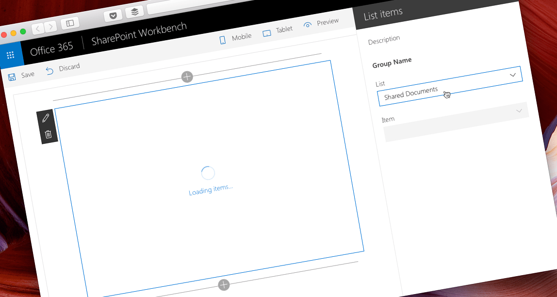
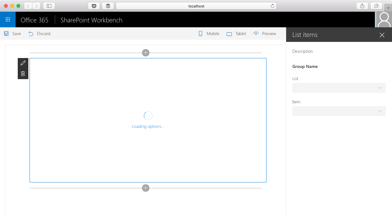
Load available options only when configuring web parts
When working with cascading dropdowns you can use both static datasets, that you know upfront (such as geography), or dynamic datasets, that come from a SharePoint list of an API. If the data comes from an external source, it might take a moment to load it, which would likely delay loading the web part. You should therefore load the list of available options only when configuring the web part.
The key part to understand here is that the list of all available options is required only when configuring the web part. Once user selects a value in the dropdown, that value becomes persisted in web part properties from where it can be retrieved to load the corresponding data.
The correct way to load the list of options available initially (usually these are only the first-level options) is by overriding the web part’s onPropertyPaneConfigurationStart method, which is triggered after user chose to edit web part’s configuration.
export default class ListItemsWebPart extends BaseClientSideWebPart<IListItemsWebPartProps> {
  // ...
  protected onPropertyPaneConfigurationStart(): void {
    // ...
    if (this.lists) {
      return;
    }

    this.loadLists();
    // ...
  }
  // ...
}
Because users can choose to edit web part properties multiple times without refreshing the page, you should only load the list of all available options if they haven’t been already loaded.
If you would choose to load the information about available options in the onInit method instead, it would be loaded also when the user isn’t configuring the web part which would unnecessarily slow down the page.
Communicate long-running operations in the UI
Loading data from SharePoint or an API might take a moment depending on a number of factors. To keep the web part responsive, you should communicate any operation that isn’t instantaneous to the user. This can be done by calling the displayLoadingIndicator method:
export default class ListItemsWebPart extends BaseClientSideWebPart<IListItemsWebPartProps> {
  // ...
  protected onPropertyPaneConfigurationStart(): void {
    // ...
    this.context.statusRenderer.displayLoadingIndicator(this.domElement, 'lists');

    this.loadLists();
    // ...
  }
  // ...
}
When called, the displayLoadingIndicator method will replace the contents of the DOM element specified in the first parameter with a spinner and a Loading message followed by the string passed in the second parameter.
Once loading is completed, you can remove the loading indicator by calling the clearLoadingIndicator method. Calling this method clears the contents of the specified DOM element. In case of a web part it should be followed by calling the render method to re-render the web part.
Load depending items
When working with cascading dropdowns the value selected in one dropdown determines the available values in other dropdowns. To implement this in web part properties you should handle the event that occurs after user selected a value in a dropdown. You can do this by overriding the onPropertyPaneFieldChanged method. In this method you can inspect which property has been changed and handle the change accordingly.
In case the user selected a value in the child dropdown you would only need to persist the selected value in web part properties. If the user changed the value of the parent dropdown then, next to persisting the selected value in the web part properties, you would have to reset the value selected in the child dropdown and load its available options corresponding to the selected value.
Summary
When building web parts, developers regularly need to support configuration in such a way that one web part property depends on another. Such requirement can be implemented using cascading dropdowns. Recently Microsoft published a tutorial describing the implementation process step-by-step. Follow the tutorial at https://dev.office.com/sharepoint/docs/spfx/web-parts/guidance/use-cascading-dropdowns-in-web-part-properties.
View code sample: Custom property pane controls built in React (GitHub) Watch PnP webcast: Cascading property pane drop-downs with SharePoint Framework (YouTube)