
Conditional content on mobile devices the easy way in SharePoint 2010
One of the frequently asked questions is how to show or hide some content on mobile devices in SharePoint 2010. In this post you can see how to do this the easy way.
More mobile, less content
In the last few years more and more mobile devices are used to browse the web. On this site only, the usage of mobile device has grown 4,5 times in the last two years! Depending on your audience you can see less or more mobile devices visiting your website, but one thing is for sure: you can no longer ignore mobile users.
Although mobile devices lower the bar for accessing information on the Internet they have their restrictions, such as screen size or bandwidth. In order to deliver optimal experience to your visitors you not only have to consider laying out all the different elements on the page, given the limited screen size, but also have to think about the amount of information you want to serve to your users to ensure that your website will load fast.
Applying responsive web design allows you to ensure that your website will be easy to use and the content will fit the limited screen space perfectly. To really optimize your website for mobile devices however, you might want to go a step further and remove the unnecessary content from the HTML markup using conditional content. By removing the undesired HTML markup you will decrease the size of your web pages which in result will make your web pages load faster on mobile devices.
Content: it’s not unconditional
You can implement conditional content in SharePoint 2010 in many ways. Using the ASP.NET LoginView control you can for example easily display content to anonymous and authenticated users. If you however are looking for a more powerful and flexible mechanism, you will quickly notice that you will have to build your own solution to support your requirements. A while ago I showed you the ConditionallyVisibleControl that I use as the base whenever I need to conditionally show content in SharePoint 2010.
[ParseChildren(true)]
public abstract class ConditionallyVisibleControl : Control {
    public ITemplate ContentTemplate { get; set; }

    public abstract bool ShouldBeVisible { get; }

    protected override void CreateChildControls() {
        base.CreateChildControls();

        if (ShouldBeVisible && ContentTemplate != null) {
            Control container = new Control();
            ContentTemplate.InstantiateIn(container);
            Controls.Add(container);
        }
    }
}
On top of this base class I can then build any kind of logic to support any kind of requirements I might get, such as conditionally showing or hiding content for mobile devices.
Conditional content on mobile devices in SharePoint 2010
Although conditionally displaying or hiding content in SharePoint 2010 is not that complex, it has a few gotchas to it and if you don’t deal it with properly you might be making it more complex than necessary.
Inconvenient SharePoint 2010 mobile redirect
SharePoint 2010 has built-in support for mobile device recognition. Once it detects it’s a mobile device that you are using, it will redirect you to its mobile interface. And since it’s not necessarily the behavior you might want, you might as well want to have SharePoint not redirect you to its mobile experience. Yet you would still want to keep a track of the fact it’s a mobile device that is accessing the site!
The way SharePoint 2010 mobile redirect is built, there is no easy way of disabling it. A while ago I wrote about this challenge in detail and presented a solution also known as Mavention No Mobile Redirect. The great thing about this solution is that does exactly what you want: it prevents the default SharePoint 2010 mobile redirect from firing off and yet keeps all the device information that you need.
Conditional content on mobile with Mobile Trimmed Control
With the SharePoint 2010 mobile redirect sorted out the next thing to do is to create a custom control that inherits from the ConditionallyVisibleControl and which allows the rendering based on the mobile device detection. Following is the code snippet that shows such control:
public class MobileTrimmedControl : ConditionallyVisibleControl {
    public bool Not { get; set; }

    public override bool ShouldBeVisible {
        get {
            bool shouldBeVisible = false;

            if (HttpContext.Current != null &&
                HttpContext.Current.Request != null &&
                HttpContext.Current.Request.Browser != null) {
                shouldBeVisible = HttpContext.Current.Request.Browser.IsMobileDevice != Not;
            }

            return shouldBeVisible;
        }
    }
}
The working of this control is very straight forward: first we ensure that the browser information is present. Then we check if the browser is a mobile browser or not and depending on the value we either render or hide the contents of the control. To offer additional flexibility the control also contains the Not property that allows you to negate the comparison: should you need to render some content only for browsers that aren’t mobile, all you have to do is to set the Not property to true. This gives you not only the ability to conditionally render additional content for mobile devices but also to hide some content from mobile devices as well.
The last step left is to add the control to a Master Page, Page Layout or a User Control and have it display content conditionally for mobile devices:
<Mavention:MobileTrimmedControl runat="server">
    <ContentTemplate>
        <h2>Hello mobile!</h2>
    </ContentTemplate>
</Mavention:MobileTrimmedControl>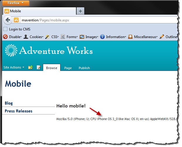
…or non mobile devices:
<Mavention:MobileTrimmedControl Not="true" runat="server">
    <ContentTemplate>
        <h2>Shhht, desktop only...</h2>
    </ContentTemplate>
</Mavention:MobileTrimmedControl>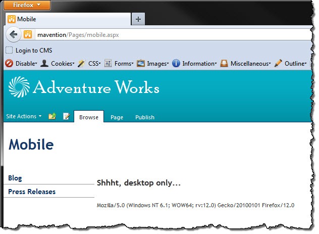
Summary
Although SharePoint 2010 offers you some control of the mobile experience, implementing conditional content for mobile devices requires custom development. Using the Mavention No Mobile Redirect solution and a fairly simple custom control you can conditionally display or hide content from mobile devices.