Easier implementing custom user experiences in SharePoint 2010 with Sandboxed User Controls
Custom Controls are invaluable when working with Web Content Management solutions on the SharePoint 2010 platform. Unfortunately they are pretty inconvenient to use with large portions of HTML markup. Find out how to create better controls in SharePoint 2010.
Web Content Management solutions are different than other types of SharePoint solutions. One of the main differences is the amount of custom development that WCM solutions require. Because the user experience of a public-facing website is nothing but standard, in most situations you will have to build some custom components to deliver the desired solution.
Web Parts vs. controls
When implementing custom user experiences on the SharePoint platform, there are in general two kinds of things that you can develop. You will be either building Web Parts or custom controls. Whenever you want to enable site managers to dynamically compose the content of certain pages you will build Web Parts and provisions them to the Web Part Gallery for easy use. For all the other dynamic pieces of the user experience you will be using custom controls.
You can think of Web Parts as of advanced types of controls. Thanks to the Web Parts Framework implemented in SharePoint, users can easily create dynamic websites. At the end however, Web Parts are nothing more than special kind of controls and you can use them as such while implementing custom user experiences in SharePoint. Although you might want to write a Web Part for every single piece of dynamic functionality in your user experience it’s not really wise to do so. After all what are the odds of site managers using the bottom menu with copyright and sitemap links anywhere else than at the bottom of the site? So because You Ain’t Gonna Need It, let’s agree for now that custom controls are the way to go.
Why custom controls are not always the best choice you have?
Using custom controls for building dynamic pieces of custom user experiences is very easy. With just a few lines of code you can turn static HTML into dynamic content pulled from SharePoint. There are however scenarios when custom controls are pretty inconvenient to use. Consider the following HTML snippet:
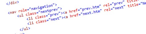
<ul class="nextprev">
    <li class="prev"><a href="prev.aspx" rel="prev" title="Previous press release: Lorem ipsum"><img src="images/prevbutton.png" alt="Left arrow" /></a></li>
    <li class="next"><a href="next.aspx" rel="next" title="Next press release: Lorem ipsum"><img src="images/nextbutton.png" alt="Right arrow" /></a></li>
</ul>
This snippet contains links to the previous and next press release to allow visitors to quickly navigate through press releases. In order to create such output using a custom control, you would have to use the following code snippet:
protected override void Render(HtmlTextWriter writer) {
    if (!String.IsNullOrEmpty(previousPressReleaseUrl) ||
        !String.IsNullOrEmpty(nextPressReleaseUrl)) {
        writer.AddAttribute(HtmlTextWriterAttribute.Class, "nextprev");
        writer.RenderBeginTag(HtmlTextWriterTag.Ul);

        if (!String.IsNullOrEmpty(previousPressReleaseUrl)) {
            writer.AddAttribute(HtmlTextWriterAttribute.Class, "prev");
            writer.RenderBeginTag(HtmlTextWriterTag.Li);

            writer.AddAttribute(HtmlTextWriterAttribute.Href, previousPressReleaseUrl);
            writer.AddAttribute(HtmlTextWriterAttribute.Rel, "prev");
            writer.AddAttribute(HtmlTextWriterAttribute.Title, String.Format("Previous press release: {0}", previousPressReleaseTitle ?? String.Empty));
            writer.RenderBeginTag(HtmlTextWriterTag.A);

            writer.AddAttribute(HtmlTextWriterAttribute.Src, SPUtility.GetServerRelativeUrlFromPrefixedUrl("~sitecollection/_layouts/images/prevbutton.png"));
            writer.AddAttribute(HtmlTextWriterAttribute.Alt, "Left arrow");
            writer.RenderBeginTag(HtmlTextWriterTag.Img);
            writer.RenderEndTag(); //img

            writer.RenderEndTag(); //a
            writer.RenderEndTag(); //li
        }

        if (!String.IsNullOrEmpty(nextPressReleaseUrl)) {
            writer.AddAttribute(HtmlTextWriterAttribute.Class, "next");
            writer.RenderBeginTag(HtmlTextWriterTag.Li);

            writer.AddAttribute(HtmlTextWriterAttribute.Href, nextPressReleaseUrl);
            writer.AddAttribute(HtmlTextWriterAttribute.Rel, "next");
            writer.AddAttribute(HtmlTextWriterAttribute.Title, String.Format("Next press release: {0}", nextPressReleaseTitle ?? String.Empty));
            writer.RenderBeginTag(HtmlTextWriterTag.A);

            writer.AddAttribute(HtmlTextWriterAttribute.Src, SPUtility.GetServerRelativeUrlFromPrefixedUrl("~sitecollection/_layouts/images/nextbutton.png"));
            writer.AddAttribute(HtmlTextWriterAttribute.Alt, "Right arrow");
            writer.RenderBeginTag(HtmlTextWriterTag.Img);
            writer.RenderEndTag(); //img

            writer.RenderEndTag(); //a
            writer.RenderEndTag(); //li
        }

        writer.RenderEndTag(); //ul
    }
}
As you can see, the original HTML structure is easily lost and you can only imagine how complex maintaining such controls will be. So how should we deal with it?
Easier implementing UI with Visual Web Part (Sandboxed)
The challenge of implementing complex user experiences in dynamic components isn’t specific to custom controls only. Also when building Web Parts you will face the same challenges. Luckily, at least if you’re using the Visual Studio 2010 SharePoint Developer Tools, there is some good news. With the release of Visual Studio 2010 SharePoint Power Tools the Visual Studio team provided us with the Visual Web Part (Sandboxed) that allows you to implement your user experience declaratively and then fill it with dynamic content rather than mixing it all in code behind. Let’s take a look at the following code snippet that shows the same control as created previously but then using the Visual Web Part (Sandboxed).
<%@ Assembly Name="$SharePoint.Project.AssemblyFullName$" %>
<%@ Assembly Name="Microsoft.Web.CommandUI, Version=14.0.0.0, Culture=neutral, PublicKeyToken=71e9bce111e9429c" %>
<%@ Register Tagprefix="SharePoint" Namespace="Microsoft.SharePoint.WebControls" Assembly="Microsoft.SharePoint, Version=14.0.0.0, Culture=neutral, PublicKeyToken=71e9bce111e9429c" %>
<%@ Register Tagprefix="Utilities" Namespace="Microsoft.SharePoint.Utilities" Assembly="Microsoft.SharePoint, Version=14.0.0.0, Culture=neutral, PublicKeyToken=71e9bce111e9429c" %>
<%@ Import Namespace="Microsoft.SharePoint" %>
<%@ Register Tagprefix="WebPartPages" Namespace="Microsoft.SharePoint.WebPartPages" Assembly="Microsoft.SharePoint, Version=14.0.0.0, Culture=neutral, PublicKeyToken=71e9bce111e9429c" %>
<%@ Control Language="C#" AutoEventWireup="true" CodeBehind="PrevNextPressReleaseWebPart.ascx.cs" Inherits="SharePointProject3.PrevNextPressReleaseWebPart.PrevNextPressReleaseWebPart" %>
<ul class="nextprev">
    <li class="prev" runat="server" id="prevButton"><a href="<%= prevPressReleaseUrl %>" rel="prev" title="Previous press release: <%= prevPressReleaseTitle %>"><img src="/_layouts/images/prevbutton.png" runat="server" alt="Left arrow" /></a></li>
    <li class="next" runat="server" id="nextButton"><a href="<%= nextPressReleaseUrl %>" rel="next" title="Next press release: <%= nextPressReleaseTitle %>"><img src="/_layouts/images/nextbutton.png" runat="server" alt="Right arrow" /></a></li>
</ul>
public partial class PrevNextPressReleaseWebPart : System.Web.UI.WebControls.WebParts.WebPart {
private string prevPressReleaseUrl;
private string prevPressReleaseTitle;
private string nextPressReleaseUrl;
private string nextPressReleaseTitle;
protected override void OnInit(EventArgs e) {
    base.OnInit(e);
    InitializeControl();
}
protected void Page_Load(object sender, EventArgs e) {
GetPrevNextPressReleaseInfo(out prevPressReleaseTitle, out prevPressReleaseUrl, out nextPressReleaseTitle, out nextPressReleaseUrl);
}
private void GetPrevNextPressReleaseInfo(out string previousPressReleaseTitle, out string previousPressReleaseUrl, out string nextPressReleaseTitle, out string nextPressReleaseUrl) {
previousPressReleaseTitle = null;
previousPressReleaseUrl = null;
nextPressReleaseTitle = null;
nextPressReleaseUrl = null;
// ...
}
}The User Control (.ascx) part of the Visual Web Part (Sandboxed) contains the UI portion of the control while the code behind is much cleaner with defining only the logic to fill the placeholders with the content from SharePoint.
Another great thing about using the Visual Web Part (Sandboxed) for this purpose is, that the User Control is not being deployed to the server. During the building process, the content of the User Controls are translated to a class which is then being compiled and included in the output assembly. This is great not only from the Application Lifecycle Management perspective (to update the control you only need to update the assembly) but also from the performance point of view (loading and instantiating User Controls from separate .ascx files is slower) not to mention security reasons (instantiating user controls from separate .ascx files requires full trust permissions) and flexibility (because nothing is being deployed to the file system, you can use Visual Web Parts (Sandboxed) in Sandboxed Solutions including solutions for Office 365).
So if the concept of precompiled User Controls gives such great results why not apply it to custom controls as well?
Sandboxed User Controls
The great news is that in order to create Sandboxed User Controls you don’t have to do much, assuming you are already using the Visual Studio SharePoint 2010 Developer Tools and the Power Tools which contain the Visual Web Part (Sandboxed) SharePoint Project Item (SPI) Template.
The name Sandboxed refers here to the process that the Visual Web Part (Sandboxed) is using to precompile the .ascx file. At this moment it is however not possible to use controls in Sandboxed Solutions.
Anatomy of a Visual Web Part (Sandboxed)
Before we proceed with creating Sandboxed User Controls it is important that you understand how the process of translating the contents of the .ascx file looks like.
After you create a Visual Web Part (Sandboxed) SPI a few files are added to your project:
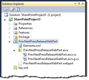
- Web Part SPI folder
- Elements.xml file that provisions the .webpart file to the Web Part Gallery
- .webpart file that contains the Web Part definition
- Web Part UI (.ascx)
- Web Part UI code behind (ascx.cs if you’re using c#)
If you compare those files with the regular Visual Web Part you should notice that there is no separate code file for the Web Part (.cs). As I mentioned before, before compiling the code, the contents of the .ascx file will be translated to a class (.ascx.g.cs) which can be then compiled and included in the output assembly. The process of translating the .ascx file into a .ascx.g.cs file is being done by the Visual Studio 2010 SharePoint Developer Tools PowerTools and for this to work, the .ascx file must have the Custom Tool property set to SharePointWebPartCodeGenerator.
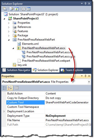
Without this the ASCX file will be treated like a regular User Control that should be deployed to the SharePoint Root.
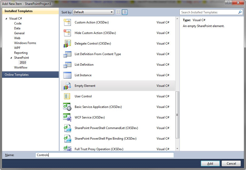
Creating Sandboxed User Controls
Let’s start by creating an Empty Element called Controls. Because we don’t have a specific SPI Template for Sandboxed Visual Control at this moment, it will allow us to provision required SafeControl entries for our custom control.
In the Controls SPI, remove the Elements.xml file and a SafeControls entry using the SPI Properties.

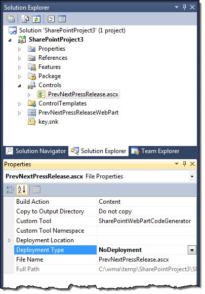
Next add a User Control to the Controls container. Notice that the Visual Studio SharePoint Developer Tools moved the created .ascx file to the ControlTemplates Mapped Folder.
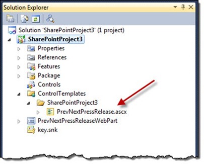
Move the .ascx file back to the Controls container and remove the ascx.designer.cs file.
In the properties of the .ascx file set the Build Action property to Content, the Custom Tool property to SharePointWebPartCodeGenerator so that the contents of the .ascx file will get included in the output assembly without the .ascx file itself being deployed and finally Deployment Type to NoDeployment.
The last step that you have to do is to modify the code so that the generated control UI will be loaded properly. For this change the base class for the User Control to System.Web.UI.Control and add the OnInit handler:
protected override void OnInit(EventArgs e) {
base.OnInit(e);
InitializeControl();
}Now, every time you edit and save the .ascx file, the .ascx.g.cs file will be recreated containing all the UI markup and controls as specified in the .ascx file. And when you build the project, the complete control will be included in the output assembly. Calling the InitializeControl method will cause the control to instantiate the UI generated by the SharePointWebPartCodeGenerator tool.
Summary
When working on Web Content Management solutions on the SharePoint platform, you often have to build custom components to implement the dynamic pieces of the user experience. Because such components can contain a lot of HTML markup, it is inconvenient to do it all imperatively using code behind of custom controls. Sandboxed User Controls which combine the flexibility and ease of use of User Controls and the performance and ALM benefits of custom controls are often a better approach that you should consider.