Mavention.nl v3: How we did it? – The User Experience
Go on: play with the size of your browser window when browsing our new website, see how the layout refloats? Have you opened our site on your mobile devices? Have you opened it on all of them? In this part of the ‘How we did it?’ series I will tell you about the UX choices that we have made to ensure that our new website offers the best experience to all of our visitors.
Planning for the User Experience
The moment we knew we were about to build a new website, we started thinking about its user experience. We came up with a number of device types that we would like to support. Although the majority of our visitors were still using desktops/laptops with full-featured operating systems in browsers, in the last two years we noticed a slight yet continuing increase in mobile devices.
With the upcoming release of Windows 8 later this year together with Microsoft Surface and other tablets and Windows Phone 8 devices, we just couldn’t ignore mobile devices. Particularly given the fact that our website will be very likely serving us for the next 2 to 3 years we knew we needed a website that is flexible and future-proof.
We are a small company with great potential. And although we are eager to explore new technologies and we spend quite some time doing just that, we don’t have a separate department or even a dedicated team that takes care of our website. Everything that you see on our website is done by us. Given the limited time that we have available to maintain the website we wanted our website to support as many devices with as little effort possible.
Considering the different options available to us we eventually chose to leverage response web design. By serving the same HTML markup despite the browser/device/OS and just by refloating the different UI elements responsive web design allows you to serve different user experiences to different devices. And because the HTML doesn’t change, you can make better use of server-side caching and you have less SharePoint artifacts to maintain. Additional great benefit of responsive web design is that it’s capability based as opposite to device based. Because of this it doesn’t require you to maintain a list of all the different devices that you would like to support. Instead you can just focus on the capabilities that have impact on the user experience and check if they are available for specific visitors or not. Later on we were pleased to see that we made the right choice when we saw Google’s recommendation for optimizing websites for mobile devices.
Designing for the User Experience
Once we knew we wanted to leverage responsive web design on our new website, we started analyzing the browsers our visitors are using to figure out which different devices our audience is using and what capabilities we should take into account.
While analyzing our web analytics data we found out that nearly 30% of our mobile visitors are using iPad followed by roughly 20% using iPhones. 16% of our mobile visitors are using Windows Phone devices which might just become more at the end of this year given the announced release of Windows 8 and Windows Phone 8 and new devices supporting those operating systems.
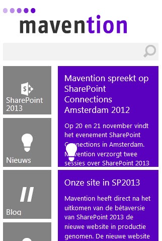
Width regard to screen resolutions of our visitors we found out that more than 35% used screen width of at least 1600px, so we had to make the best use possible of the available screen estate not forgetting about mobile device users whose screens are much smaller.
Based on that data we gathered we chose to define a number of break points at which our design would reflow:
- more than 1639px width
- between 970px and 1280px width
- between 647px and 969px width
- less than 647px width
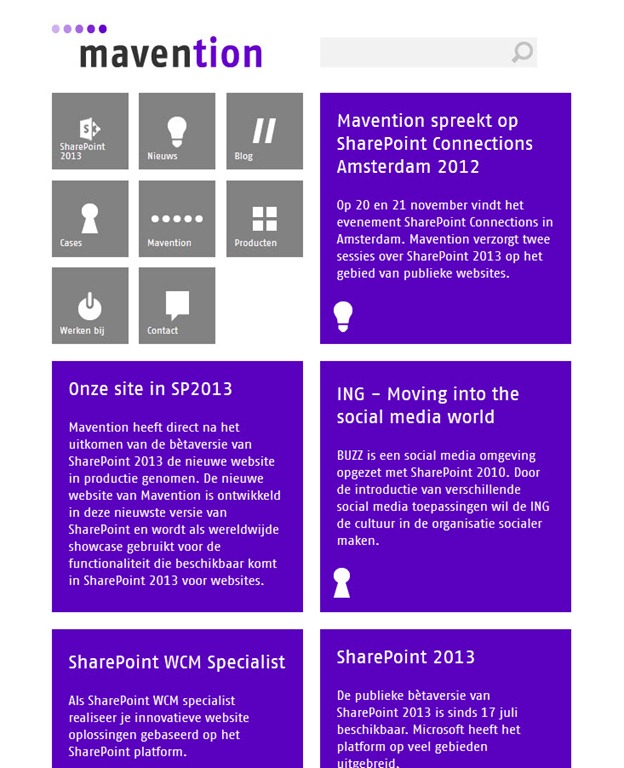
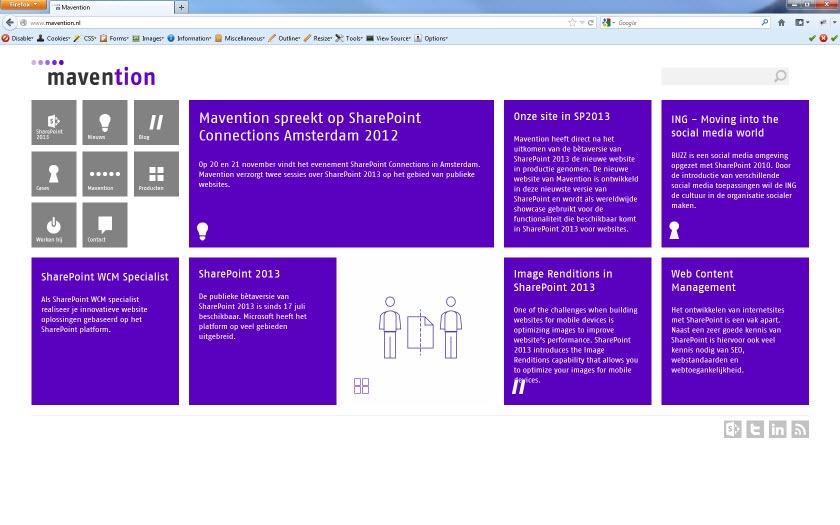
Although we aimed for making the best use of the available screen estate possible, we also kept readability of the content in mind. With this we decided that while the home page could resize to fit the screen, a content page should get no wider than 1260px with of which 610px taken by the content area. Defining a maximum width on the body area helps us ensure that you can read the text without moving your head as if you watching a tennis game.
Building the User Experience
We started building the User Experience from building static HTML templates. Based on design crafted for us by a design agency we created HTML pages so that we could see how the different UI blocks would reflow at different screen resolutions. Once we were satisfied about that, we moved on to implementing the user experience in SharePoint 2013.
There are different approaches to implementing custom user experiences in SharePoint and depending on who you ask, you might get a different answer about what the best approach is. Here at Mavention we are convinced that the approach depends on the scenario and for public-facing websites you might be better off by crafting static HTML templates and implementing them in SharePoint rather than using a standard Publishing Page and make it look okay. The reason for our preference is the importance of the HTML markup which is the only way for you to add meaning to your content on the web. This is important not only from the Search Engine Optimization perspective but also for accessibility purposes. So in order to get the most out of our website we decided to start from the minimal HTML required for our website and strive to have SharePoint 2013 output just that.
A short note on SharePoint 2013 Device Channels
One of the new capabilities of SharePoint 2013 are Device Channels that allow you to optimize the user experience served to different devices. As mentioned before, for our website we chose to use responsive web design which is based on the paradigm of delivering the same HTML to every device. And although we haven’t used Device Channels for delivering different user experiences to different devices, we do benefit of this new capability. I will discuss more about that in the future posts in the “Mavention.nl v3: How we did it?” series when we will discuss the optimization techniques that we have applied on our website.
The Result
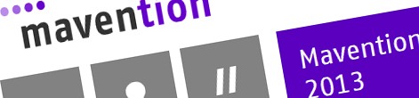
Everything that you have read about here can be seen and played with on our new website available at http://www.mavention.nl. So far we’ve got lots of passionate feedback regarding the user experience on different devices but also on using tiles and the purple color throughout our website. We appreciate all of your feedback a lot and hope you will spend a moment to click around on our new website to see what can be achieved using SharePoint 2013 and tell us what you think.