Preview content on mobile devices with Mavention Mobile Preview
Are you publishing content on your website and are unsure if it will be displayed properly on mobile devices? Doubt no more with Mavention Mobile Preview!
Publishing to mobile? Where is the preview?
When publishing web content, content authors often wonder if the content will be laid out properly on mobile devices. With the ever increasing share of mobile devices on the Internet, the importance of providing optimized user experiences for different form factors is an essential step in the success of every website.
There is no doubt that you can build great experiences for all the different channels on your SharePoint 2013 public-facing website. SharePoint offers you a variety of choices with regard to optimizing your website for different form factors. Unfortunately one thing that is missing, is the ability to preview how your content will look like on the different devices – preferably before even publishing it.
Because SharePoint 2013 doesn’t offer a native support for previewing content on mobile devices, you would very likely first need to publish your pages and leave the context of your website in order to verify that the new content will be displayed correctly. As you can imagine this experience is far from optimal. Luckily there is a better way to preview the content of your SharePoint 2013 public-facing website on mobile devices.
Previewing content on mobile devices with Mavention Mobile Preview
Mavention Mobile Preview is an App for SharePoint that allows you to preview how your content will look like on a mobile device.
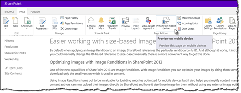
After installing the app you can open the mobile preview directly from within the page that you are editing:
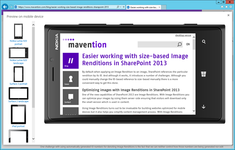
After opening the preview, the Mavention Mobile Preview App for SharePoint will open and allow you to preview your content in different form factors. Currently content can be previewed using the following devices:
- Nokia Lumia 920
- Microsoft Surface
- iPad
- iPhone 5
Each of those devices is available in both portrait and landscape mode.
Important: Mavention Mobile Preview allows you to use the form factor of the particular device only. If you are serving different content to different devices using their User-Agent string, as you do when using Device Channels, you won’t be able to take this into account at this moment.
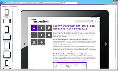
After choosing the device, the device frame will change and the form factor will be adjusted:
Should you be using Device Channels for separating the authoring and publishing experience, as we do on mavention.com, the Mavention Mobile Preview app takes that into account as well. Currently it uses the Publishing Device Channel to show the preview of the page.
This is the first release of the Mavention Mobile Preview App for SharePoint. Although the app doesn’t offer the same result as previewing a page on a real mobile device, we are convinced that it adds value by allowing content authors to verify that the content will be laid out correctly on page once published.
The app is free and we would like to invite you to download the app, give it a try and tell us what works, what didn’t work and what capabilities you would like to see in the future releases.
Install: Mavention Mobile Preview App for SharePoint for free from the Office Store


