Responsive Image Renditions with SharePoint 2013
When building responsive web designs designers and developers often focus on content. But what about the images?
It has to be responsive
More and more people use mobile devices to browse web pages. Being more often on the way it’s so much easier to use a smartphone and conveniently lookup some information just when it’s needed. Such convenience comes however with a price.
Mobile devices are small and even though the data connections are continuously improving, they are still far from being as fast as WiFi or wired connections. So in order to provide user-friendly experience web designers have to ensure that the websites that they are building will be easy to work with: both on a full-featured computer and a mobile device.
When optimizing the user experience of a website you can either choose to build a separate website targeted at mobile devices or use responsive web design where the experience automatically adjusts itself to the particular device.
Building a separate mobile website is tempting at first. After all: it all offers you the greatest control of the whole user experience including the content. In reality however it’s often too expensive and time consuming to build and maintain.
With the browsers’ capabilities improving with each new version, a frequently used alternative to building mobile websites, is using responsive web design. By leveraging the power of CSS media queries and JavaScript one and the same website can be optimally displayed on a mobile device with all its constrains yet benefit of all the rich features when displayed on a full-featured computer.
Websites that use responsive web design are not only cheaper to build and maintain. One more great benefit is, that this is the recommended way for building smartphone-optimized website by Google.
Responsive websites: more than text
When building responsive websites: no matter if you choose the mobile-first approach or if you start from the desktop variant, you will quickly find yourself working with all the different screen resolutions trying to ensure that every device will present the information on the website in the most useful way possible.
Everything that can be described using HTML can be easily scaled to fit within the constraints of the particular device. The real challenge begins however as soon as you take images into consideration. Creating and maintaining different images for different screen resolutions is time-consuming and therefore often one of the first trade-offs for websites using responsive web design.
What if, however, you could have a single image referenced from your content and have SharePoint automatically find its suitable version for the particular screen resolution?
Image Renditions – almost there
One of the frequent challenges, when working with websites, is optimizing images for the web. In most cases the original photography is too large for the web, and so it needs to be scaled and cropped. Additionally the same images are used on different pages on a website, so more than one version is needed to ensure that the image that is downloaded is not larger than necessary.
In the past managing all the different photos and sizes was done manually by content editors and, as you can imagine, it was a cumbersome thing to do. To simplify working with images, SharePoint 2013 provides the Image Renditions capability. With Image Renditions content editors can upload the original photo to an asset library and, using predefined sizes, they can then choose which photo size they want to reference from the page and SharePoint will automatically ensure that the scaled photo will be sent to the visitor.
Image Renditions are a great productivity feature simplifying the work of content editors. From the perspective of responsive web design however, they offer no added value. The image’s size, also referred to as rendition, is coded in its URL, so in order to have responsive images we would somehow need to alter the URL based on the screen size of the particular device. Doing this via page post-processing is simply too resource-intensive, but there is a much better way to have responsive images on your website built using SharePoint 2013.
Mavention Responsive Image Renditions
Mavention Responsive Image Renditions is a SharePoint 2013 solution that allows you to leverage the standard Image Renditions capability to have responsive images on your website. Following the breakpoints from your responsive web design, Mavention Responsive Image Renditions allow you to define mappings between the original image rendition and the rendition for the particular breakpoint. Based on those mappings Mavention Responsive Image Renditions will automatically choose which images should be delivered to the visitor of your website.
Installing and configuring Mavention Responsive Image Renditions
Mavention Responsive Image Renditions is a SharePoint 2013 Farm Solution, so before you start using it, you have to deploy it in your Farm.
Next, you need to activate the Mavention Responsive Image Renditions Web Application Configuration Feature on your Web Application. This Feature will install an HTTP Module which will detect which images it should load for the particular visitor.
Next, in your Site Collection, you need to activate the Mavention Responsive Image Renditions Site Collection Feature.
This Feature will create in the Root Web of your Site Collection the Responsive Image Renditions List that you can use to specify mappings between the different Image Renditions.
The last thing that you need to do is to add the ScreenWidthControl to your Master Page:
<%@ Register TagPrefix="MaventionRenditions" Namespace="Mavention.SharePoint.ResponsiveImageRenditions.Controls" Assembly="Mavention.SharePoint.ResponsiveImageRenditions, Version=1.0.0.0, Culture=neutral, PublicKeyToken=654547946f74d402" %>
<MaventionRenditions:ScreenWidthControl Domain=".mavention.com" runat="server" />
This control sets cookie that allows Mavention Responsive Image Renditions to resize the image based on the browser width. For this to work correctly there are a few things that you have to take into account. First of all the ScreenWidthControl has to be placed relatively high on your Master Page, preferably in its head section. The second thing is the domain name that you have to configure in the control. If your images are stored in the same domain as your site, you can use here the full domain name. If your images are stored on a subdomain, such as in our case (assets.mavention.com), you should provide the root domain prepended with a . (dot), eg. .mavention.com. Unfortunately, Mavention Responsive Image Renditions won’t work if your images are stored on a different domain as browsers don’t allow for cross-domain cookies setting.
Configuring Responsive Image Renditions
To give you a better understanding of what the Responsive Image Renditions are and how they work, let’s configure one for the mavention.com website.
If you examine the design of our website you will notice that we use the following breakpoints:
- width <= 646px
- 647px <= width <= 969px
- 970px <= width <= 1280px
- width >= 1640px
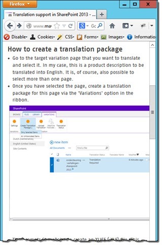
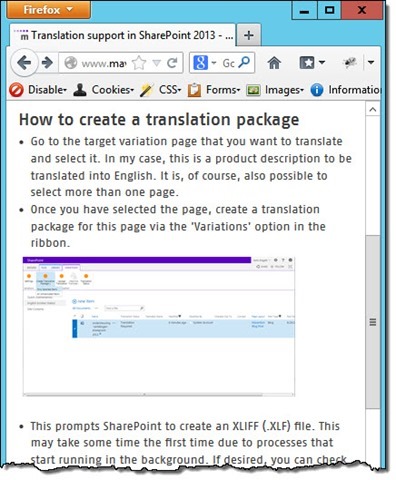
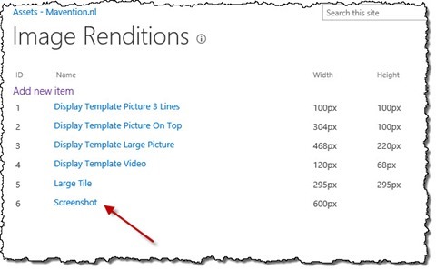
One of the image renditions that we use on our website is specific for screen shots and has configured the width of 600px.
What if we wanted to to optimize the way screenshots are displayed on mobile devices (width <= 646px)?
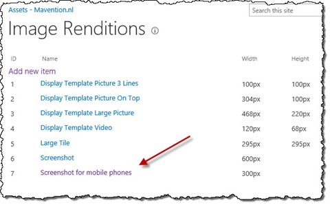
Let’s start from creating a new Image Rendition for screenshots on mobile devices. Let’s call it Screenshot for mobile phones and set its width to 300px.
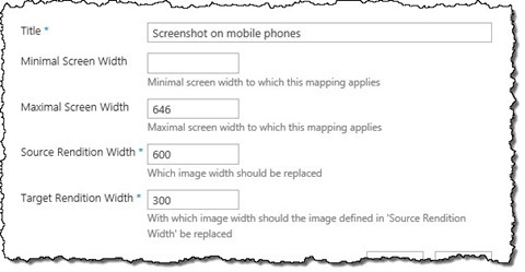
Next, let’s open the Responsive Image Renditions List and add a new Item. In the Title field, enter Screenshot on a mobile phone. Leave the Minimal Screen Width field empty and in the Maximal Screen Width field enter 646. This will match our breakpoint for mobile phones (width <= 646px). Next, in the Source Rendition Width enter 600 (which matches the width of the Screenshot Image Rendition) and in the Target Rendition Width enter 300 (which matches the width of the Screenshot for mobile phones Image Rendition). The following image shows the complete configuration of this Responsive Image Rendition.
Should you now visit the mavention.com website using a mobile phone with screen width lower than or equal 646 pixels, or would resize your browser’s window for that matter, you should see Mavention Responsive Image Renditions automatically load the optimized images of 300 pixels width instead of the originally referenced 600 pixels wide images.
Summary
When optimizing websites for mobile devices using responsive web design is the recommended approach. Although using the responsive web design approach you can easily adapt the content part of the page to fit the particular device, it’s challenging to have images size correspondingly as well. The Mavention Responsive Image Renditions solution allows you to make your images responsive as well without additional content management effort.
Download: Mavention Responsive Image Renditions (166KB, WSP)
