SharePoint mobile-friendly interface (Imtech Mobile SharePoint)
SharePoint 2007 ships with a mobile-friendly interface. In the past few years the usage of mobile devices has grown tremendously. It is then not surprising that the SharePoint team has provided a mobile-friendly interface for accessing data stored in SharePoint. Unfortunately the standard SharePoint mobile interface is far from perfect and maybe even far from useful.
It’s not Black & White
SharePoint’s Web UI is richly loaded with bulky html, images, cascading style sheets and JavaScript: 400KB in total (based on the default home page of a Collaboration Portal). Most of the desktop users don’t even notice how many requests are being fired toward the server and how many bytes are going through the pipeline. Mobile users are a different story however. So far, the mobile Internet access isn’t that fast and many users don’t have unlimited bandwidth. Limiting the number of requests and the generated HTML markup to the minimum speeds up the loading of the page and rendering it on a mobile device. It also saves you money on your cell phone bill.
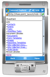 It seems like the SharePoint team has seriously took mobile devices into consideration. In the standard mobile-friendly SharePoint interface they’ve stripped all rich elements, leaving only an overview of lists located under the current site. The standard mobile view allows you to explore the contents of lists and document libraries but you will hit a wall if you want to navigate to another site.
It’s great to see that the mobile UI is very lightweight (3KB only!) and robust. Someone has really took the time to have a look at what’s really necessary to keep it functional. Hasn’t he? Personally, I think the standard SharePoint mobile UI is too lightweight – almost useless. It misses some basic functionality like menus and the way it’s all presented makes it look like we were looking at the World Wide Web in it’s very first days. We know better than that.
Call for an alternative
Mobile market has been growing very rapidly for the last few years. Looking at where the things are going, it’s more than a guess that we will see more and more of mobile devices with Internet access. They will get faster and smarter but one thing will stay the same: they won’t get any bigger. Maybe they will get even smaller? So in the next few years there will still be no room for huge and complex interfaces. “Less is more” will still be the key rule of thumb for mobile interfaces.
Considering the above I have decided to create an alternative mobile interface for SharePoint: the Imtech Mobile SharePoint solution.
Imtech Mobile SharePoint – overview
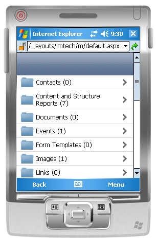
For this first release I have chosen a simple guideline: the mobile user should be able to get to any data stored in SharePoint (assuming he is granted permissions to access that data). You can neither add new items nor edit existing ones: read-only is what’s supported in this release.
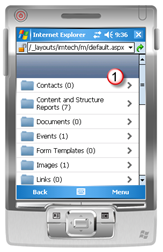
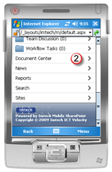
In order to access Imtech Mobile SharePoint view you have to append _layouts/Imtech/m/default.aspx to the URL of your Site Collection, eg. http://litwareinc.com/\_layouts/Imtech/m/default.aspx. The first thing you see after opening Imtech Mobile SharePoint is a list of all lists and libraries (1) and sites (2) located under the root site.
If you click on a list you will be redirected to the list view. The list view shows a list of all items in a particular list.
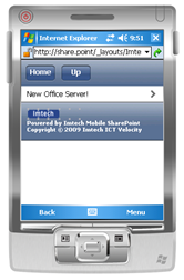 Because you’re not on the home page anymore two buttons appear in the header: Home and Up. Using these buttons you can navigate in the hierarchy of your site. The Up button redirects you to the parent element: a folder, list or a site. The list view allows you to navigate even further to view the details of list items.
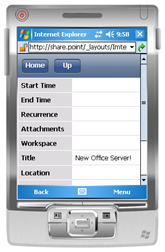 After clicking on a list item you will be redirected to the item detail view. This view is built based on the columns available in the Default View of the list where the item is located.
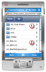 Using this version of Imtech Mobile SharePoint you can navigate not only through sites, lists and list items but also through folders. After opening a document library which contains folders, you will see a list of all folders (1) alongside the overview of all documents (2). Navigating through folders has the same User Experience as navigating through sites and lists.
Cool, isn’t it? And the best of it all: it can be installed afterwards on top of any existing site. The Imtech Mobile SharePoint solution is a set of application pages and therefore doesn’t require any modification of existing Sites. Upon deployment Imtech Mobile SharePoint can be used with any Web Application running on the farm.
Imtech Mobile SharePoint should work in every mobile device with Internet access out there. If your device is capable of rendering HTML, it should be able to run Imtech Mobile SharePoint without any problems.
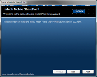
Installation of Imtech Mobile SharePoint is straight-forward. All you need to do is to deploy the solution to your farm. There isn’t even a feature you have to activate to make it work. To simplify the installation process even further I have included an installer based on SharePoint Solution Installer by Lars Fastrup.
The future
This release is the very first release of Imtech Mobile SharePoint. We have tons of new ideas here at Imtech ICT Velocity about how it could be extended to provide even better experience, but I’m particularly interested in what you think about it? Do you like it? Do you think it’s more user friendly than the standard mobile view provided with SharePoint? What would you like to see in the future releases? Your feedback can help shape this solution.
Imtech Mobile SharePoint is a free product and you can use it without any restrictions.
Download: Imtech Mobile SharePoint (144KB, ZIP)
Technorati Tags: SharePoint, SharePoint 2007, MOSS 2007, WSS 3.0, Mobile
