Web components and SharePoint Framework
Web components are the holy grail of reusable controls. But do they have a place in the SharePoint Framework and if so how to they fit together?
Controls everywhere but not for everyone
Probably every technology for building applications out there has the notion of reusable building blocks. Sometimes they’re called controls, sometimes components, but the idea behind them is the same: build a reusable piece of UI that you can configure to match the exact needs. It can be as simple as a button or as complex as a document card, interactive table or a data grid. Controls not only help you build a consistent UI but also help you prevent repeating yourself: build the functionality once and reuse as often as you need. But while the concept is ubiquitous, the implementation isn’t.
As many JavaScript frameworks are there, as many definitions of what a control or a component is. AngularJS has directives, React has components, Angular has components too, but they are totally different than React component. Vue has components too, which are almost like Angular but not quite the same and if you use jQuery, Knockout or Handlebars you need to solve the problem differently altogether. In essence, they’re all the same, but because they are so tightly coupled to the particular framework, they can’t be reused in other frameworks. The bottom line is: if you build solutions using more than one framework, reusing your work is complicated.
Write once reuse… everywhere
Web components solve the problem of different implementations of controls. While there are hundreds of libraries and frameworks that you can use to build web components, what you get as a result… is a custom HTML element! No matter which templating library or JavaScript framework you use, you can include your custom HTML element, set its attributes, trigger and respond to its events, basically do everything you would do with a regular HTML element. So if you have a calendar control, implemented as a web component, you can use it in your jQuery widget just as good as in a fully-fledged single page applications built in Angular or React.

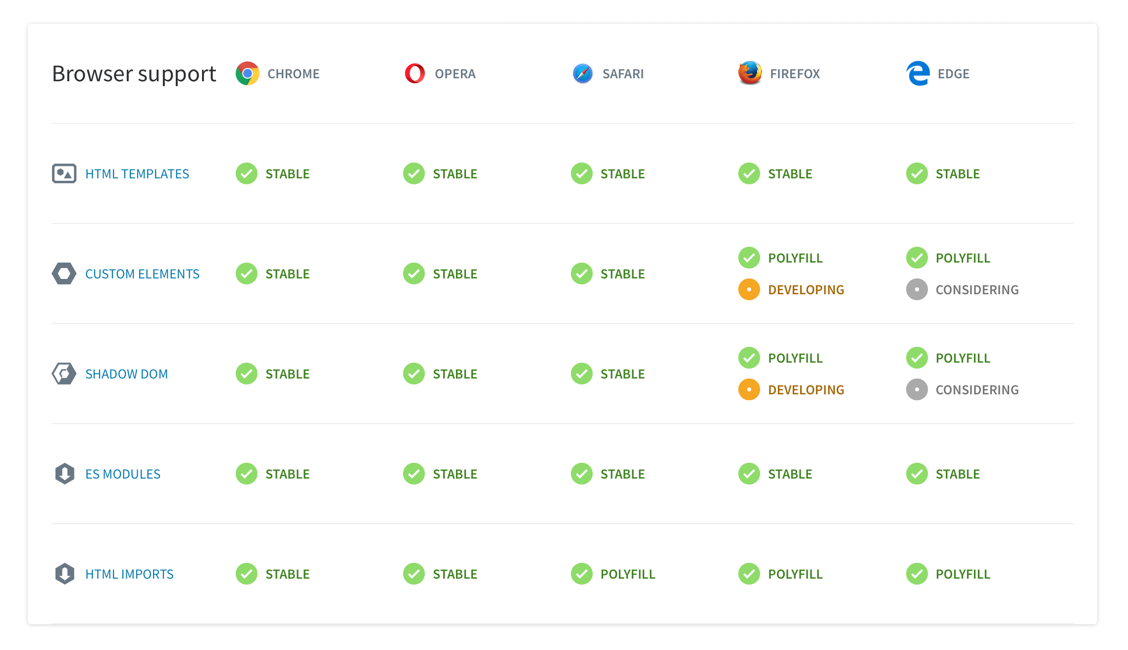
Sounds too good to be true? Well, there is a caveat indeed. Web components are based on a number of building blocks for which the support varies across the different web browsers. The good news is, that the majority of capabilities are already natively supported and where they lack, you can use polyfills that close the gaps.
Web components in the SharePoint Framework - why should you care

When building solutions on the SharePoint Framework, you can choose which JavaScript framework, if any, you want to use. While you see many articles, as well as the documentation, show samples in React, developers across the world use different frameworks such as jQuery, AngularJS, Angular, Knockout or Vue. If you work for a consultancy, or even a larger organization, there is a fair chance that you might be using different frameworks on different projects. And this is exactly why you should care about web components. Web components allow you to build controls once and reuse them in all your projects: no matter which JavaScript framework you use, no matter if it’s the Office UI Fabric components lacking for your framework or some other controls you need for your solutions.
Building web components using Stencil
There are many ways to build web components. You can use the raw browser API and take care of polyfills yourself or you can use any of the tens of frameworks that allow you to focus on building your controls and not having to worry about the intricacies of web components. One of these libraries is Stencil, which is very easy to setup and which uses a combination of React’s tsx notation and Angular’s decorators. An example component built using Stencil looks like:
import { Component, Prop } from '@stencil/core';

@Component({
  tag: 'my-first-component',
  styleUrl: 'my-first-component.scss'
})
export class MyComponent {

  // Indicate that name should be a public property on the component
  @Prop() name: string;

  render() {
    return (
      <p>
        My name is {this.name}
      </p>
    );
  }
}
To consume it, in your HTML you would use:
<my-first-component name="Waldek"></my-first-component>It’s also fine to instantiate the component in JavaScript. It’s just another HTML tag.
To get started with building web components using Stencil, ensure that you have npm@6 installed. After that, follow the documentation available at https://stenciljs.com/docs/getting-started. When you’re ready, execute npm start to preview your component in the browser and npm run build to build the project in release mode.
Using web components in SharePoint Framework solutions
When working with web components, typically you will have them defined in a separate project. After all, these are your reusable controls, not tied to a specific project or framework. To use them in a project, you would publish them as an npm package, either publicly to npmjs.com or to the private npm registry that your organization is using.
To use your web components in your SharePoint Framework project, you would install the npm package that contains the components. Next, in your web part or extension, you would import the components using
import { defineCustomElements } from 'my-components';Then, in the onInit() method, you would load the components by calling:
defineCustomElements(window);so that their corresponding custom HTML elements, get registered on the page and can be used in the HTML.
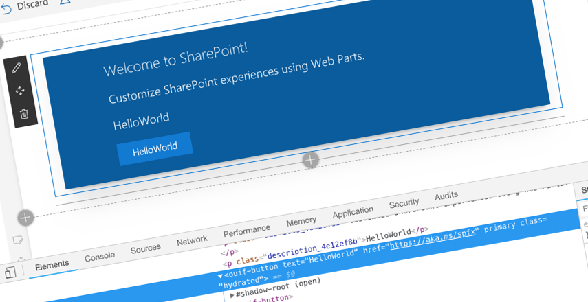
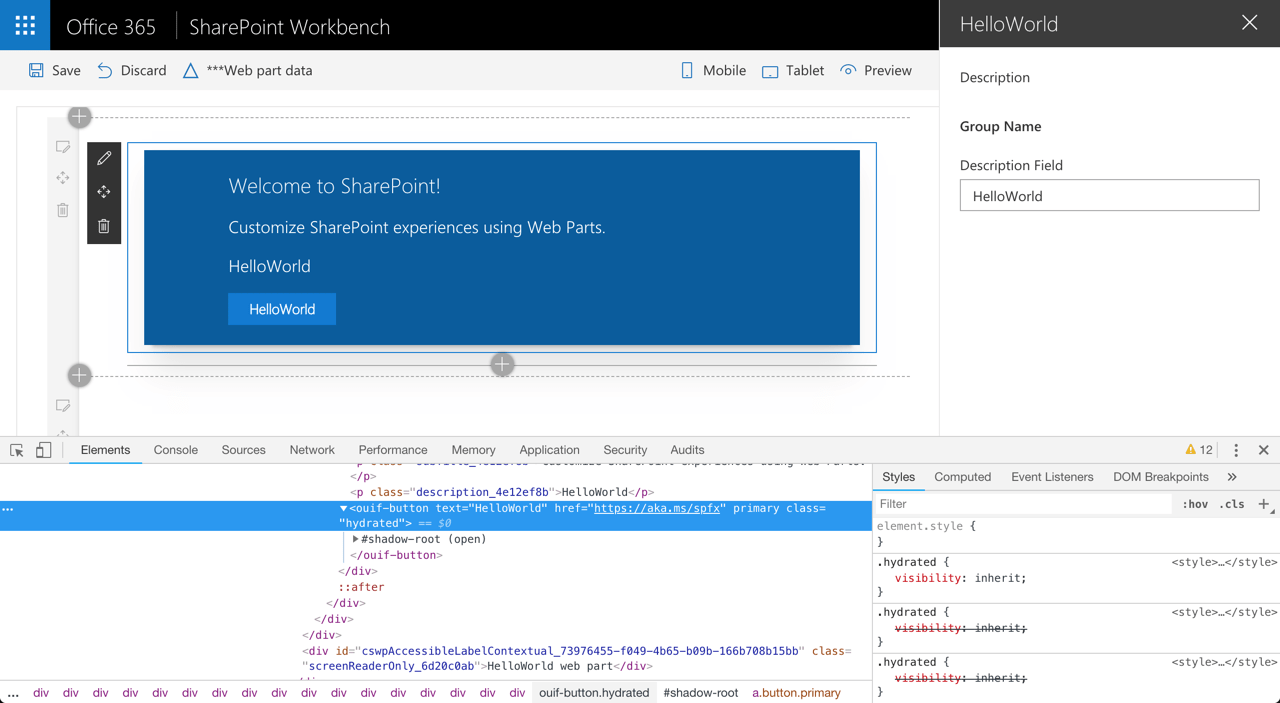
To see it in action, check out the sample repo I’ve put together at https://github.com/waldekmastykarz/demo-spfx-webcomponents. It contains a web component built using Stencil which is a Button styled after the Office UI Fabric and a no framework web part using that button. The readme explains how to get the demo running, but don’t hesitate to reach out if you’re stuck at any point.
Over to you
Today, Office UI Fabric as well as the PnP Reusable Controls are available only in React. Do you use a different framework than React in your projects and would you find it valuable to be able to use both sets of controls?